Protected Page
INCORRECT PASSWORD. PLEASE TRY AGAIN.
Humain
AI-Powered Outdoor Space Behavioural Analytics Platform
Humain is a national-level AI company under Saudi Arabia's sovereign wealth fund PIF. Monitor is its core product, transforming crowd behaviour in physical spaces into real-time, actionable operational insights through cameras and AI models, serving retail, commercial real estate, and large event venue operators.
As Lead UX Designer, I led the product's information architecture over 6 months, built a tokenised design system from scratch, and delivered the full-state Dashboard UI design and development review. The product MVP launched this January, and Humain signed its first commercial customer: a leading Saudi outdoor advertising operator, covering deployment across multiple large commercial complexes in Riyadh.
A national-level AI company's first spatial intelligence product: building a design system from scratch
What is HUMAIN
Humain is a national-level AI company founded in 2025 under Saudi Arabia's sovereign wealth fund PIF, directly championed by Crown Prince Mohammed bin Salman to drive AI infrastructure and industry adoption under Vision 2030. With mega-projects like NEOM, Red Sea, Qiddiya, and Riyadh Season accelerating demand, intelligent management of public spaces has become a critical need, and the crowd analytics market is projected to grow from $912M to $5.7B by 2030.
Product Ecosystem
Motion
Traffic scene AI analysis: vehicle recognition, licence plate detection, congestion alerts
Monitor
Real-time crowd behaviour analysis: footfall density, dwell engagement, journey tracking
Design Challenge
Monitor wasn't an iteration on an existing system. The team needed to fully migrate from the legacy SCAI interface to the new HUMAIN brand system, building a tokenised design system from scratch without slowing delivery. Joining as Lead UX Designer, I had 6 months to simultaneously define the information architecture, build a cross-product design system, and deliver complete full-state UI coverage.
Information Architecture
Define product module hierarchy, navigation structure and task flows
Design System
Build token system from scratch, aligned to Tailwind, reusable across products
Full-State UI
256+ screens covering resting, loading, error, and empty states
Early Research
With a tight delivery timeline, research ran in parallel across competitive analysis, Motion platform audits, and AI engineering alignment to identify reusable patterns, market gaps, and technical constraints.
Competitive Landscape
Competitive analysis across FootfallCam, RetailNext, and Quividi revealed that most tools achieve effective recording but lack interpretive capability; there is no active intelligence layer. Based on this gap, we established three competitive differentiators for Monitor Phase 2: AI-powered intelligence, multi-vertical architecture, and environment-aware automation.
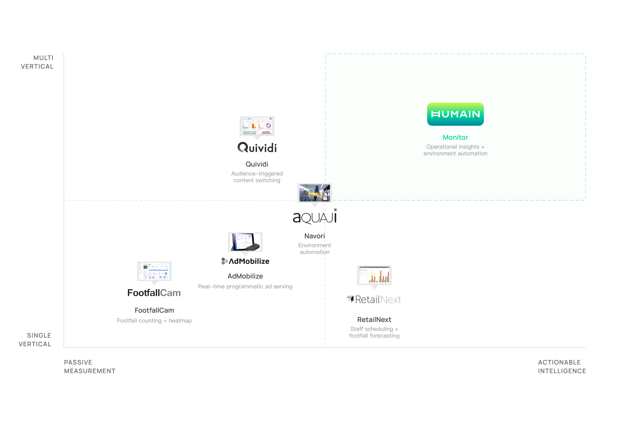
Key Differentiators
Smart Alert System
Not just data display: it automatically triggers alerts based on thresholds and anomaly patterns, enabling real-time operational response rather than post-hoc review.
Environment-Adaptive Architecture
From indoor retail to large event venues, supports data capture and analysis across different resolutions, angles and behaviour types.
Cross-Vertical Reusability
Components and data models are not bound to a specific vertical, enabling rapid replication and deployment to new use cases.
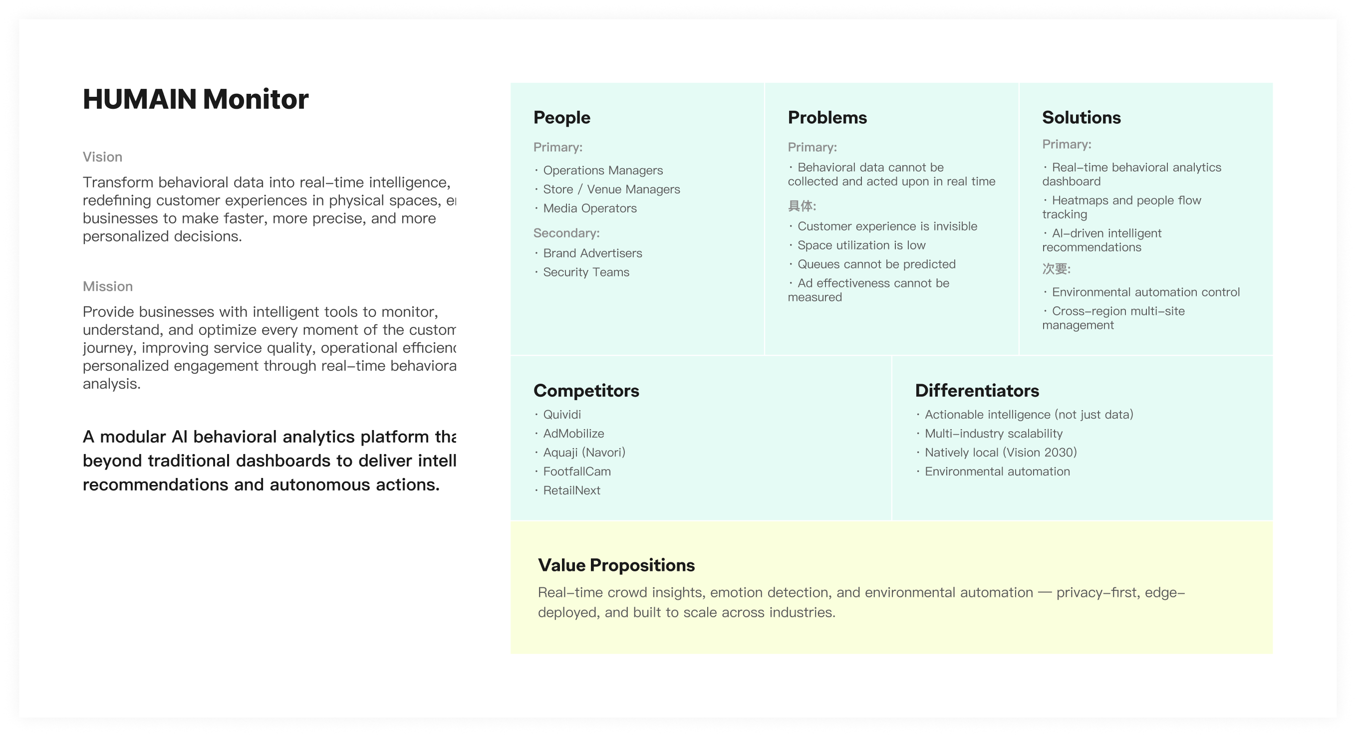
VALUE PROPOSITION
Through the landscape analysis, we mapped Monitor's product positioning across five dimensions: users, problems, solutions, competitors, and differentiators.
Defining the MVP Boundary
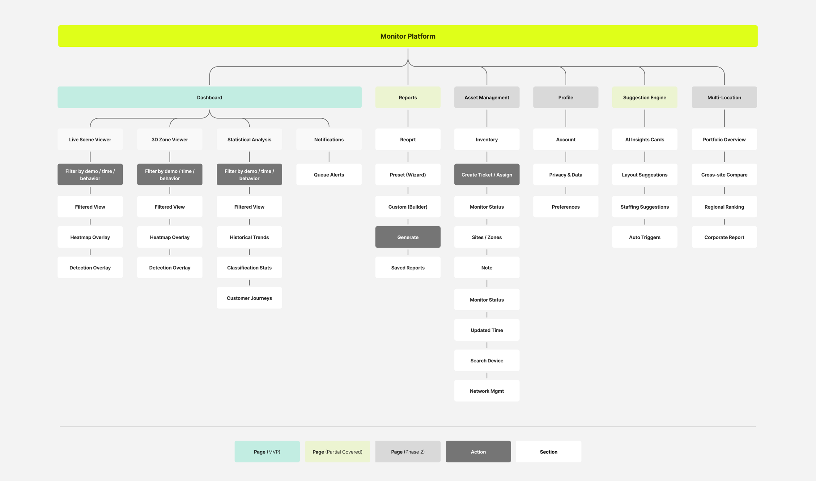
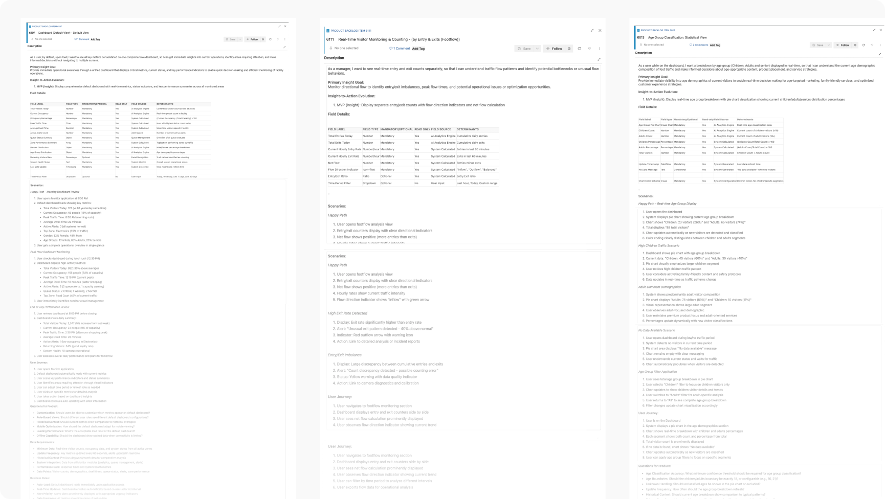
Together with the team, I used information architecture to map the full product, and User Stories to decompose the tasks and priorities each page needed to carry, ensuring every MVP design decision had a clear rationale, not just instinct.
MVP Product Scenarios
The full product spans 8 functional domains. The MVP focuses on the core journey to validate product value before expanding.
Real-Time Footfall Monitoring
- Real-time visitor count
- Crowd pattern dashboard
- Camera heatmap view
- Historical trend analysis
- Filterable heat insights
Queue & Wait Optimisation
- Queue length detection
- Wait time detection
- Capacity threshold alerts
- Congestion bottleneck ID
Crowd Profiling
- Gender classification
- Age group classification
- Dwell time analysis
- Engagement duration
Journey & Access Management
- Customer journey mapping
- User role management
- Multi-site access control
Behaviour & Sentiment Analysis
- Sentiment detection dashboard
- Satisfaction prediction
- Group / individual behaviour
Visitor Identity Recognition
- Face recognition (Opt-in)
- VIP / returning visitor tag
Personalised Marketing Engine
- Real-time behaviour recommendation
- Journey path suggestions
- Dynamic content delivery
Smart Workforce Optimisation
- Staff monitoring
- AI scheduling suggestions
- Productivity analytics
Information Architecture
Based on functional modules and user task flows, I mapped the full information architecture of the Monitor platform, covering core modules including Dashboard, Reports, and Asset Management, and defined the boundary between the MVP scope and Phase 2 expansion.
USER STORIES
Based on product requirements provided by the PM, we decomposed each User Story into three layers: user journey, scenarios, and acceptance criteria, ensuring design direction and development delivery were fully aligned.
Break each Story into a user journey: mapping the steps a user takes and clarifying where they come from and where they need to go
Map the primary flow and edge cases, covering normal usage, error states, and empty data scenarios
Capture open questions for PM clarification as they surface during decomposition, keeping requirements unambiguous
Define the completion standard for each Story, serving as the reference for design QA and developer handoff
Design & Iteration
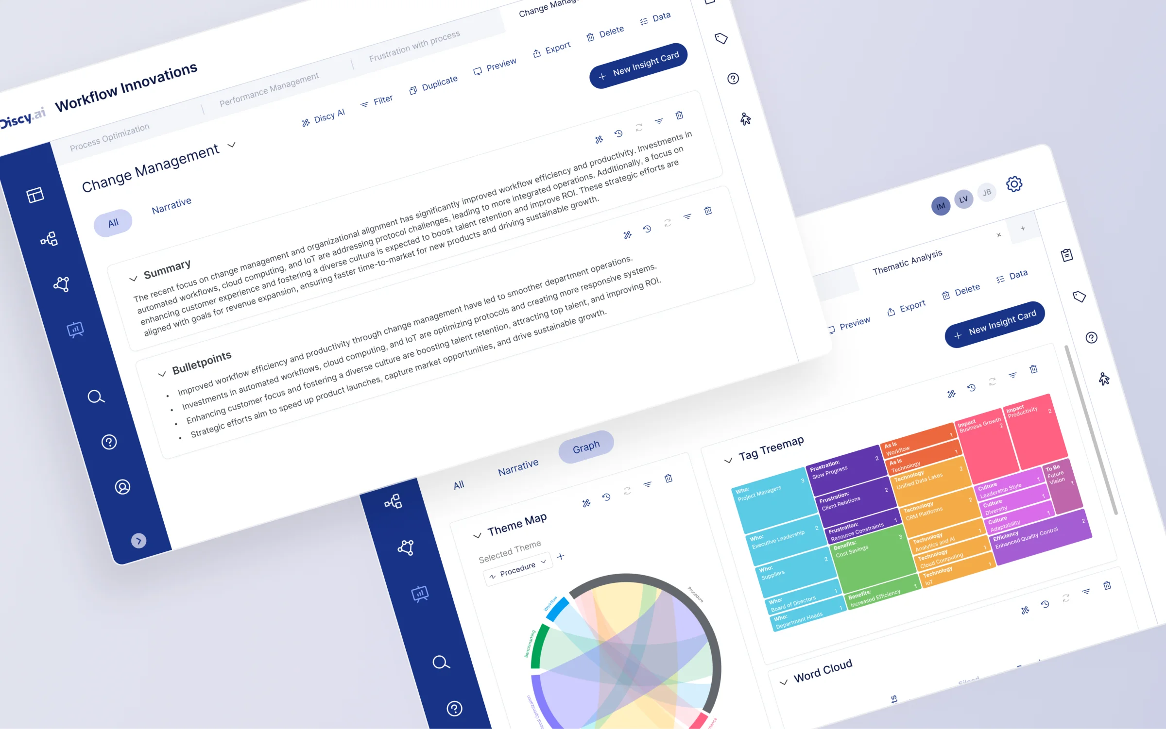
Once the MVP scope was set, the real challenge shifted from "what to build" to "how to build the right thing under constantly evolving requirements." This chapter documents the first version of the Humain Monitor Dashboard, and the progressive refinements made through cross-functional collaboration, right through to the final polish before handoff.
INITIAL CONCEPT
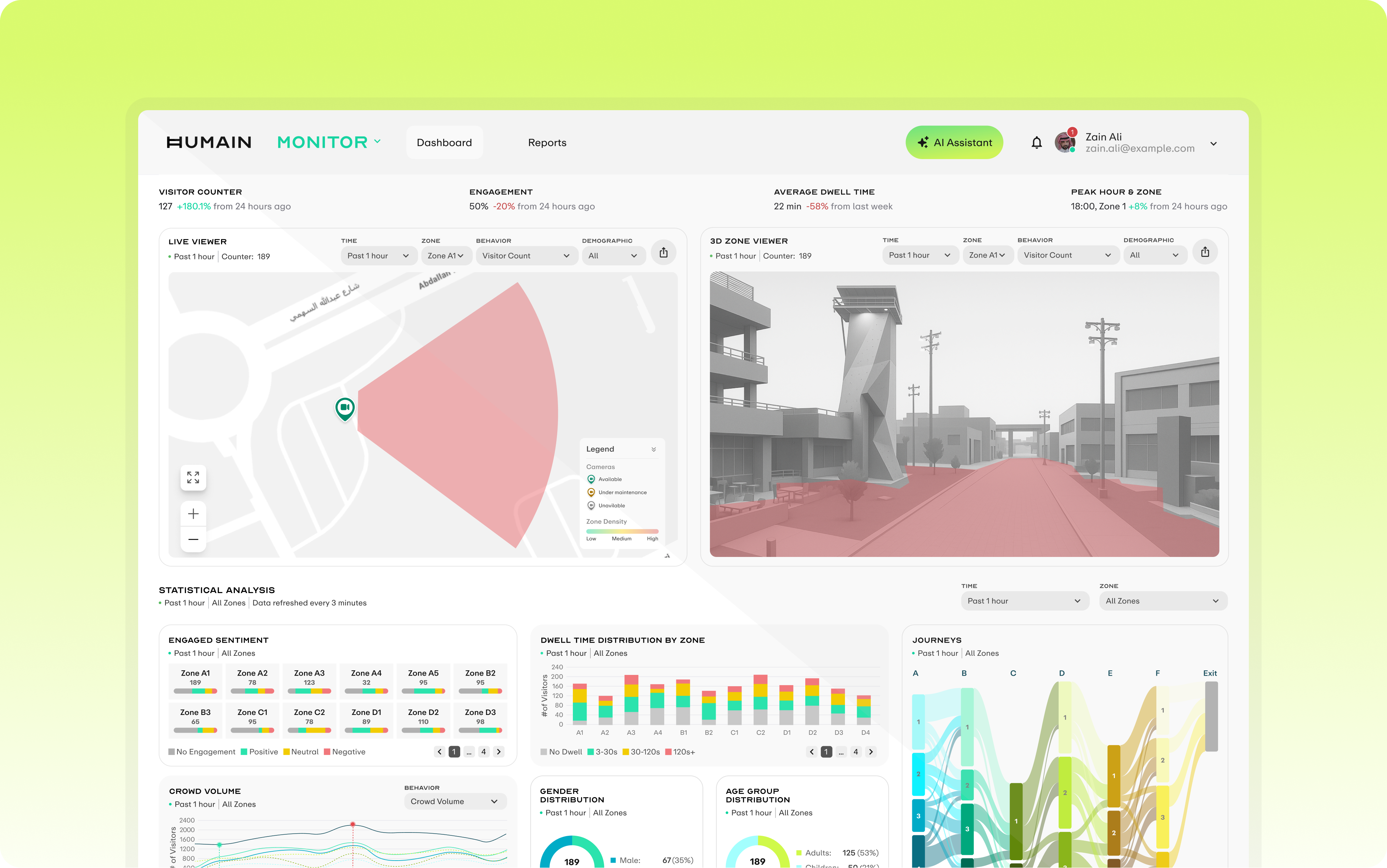
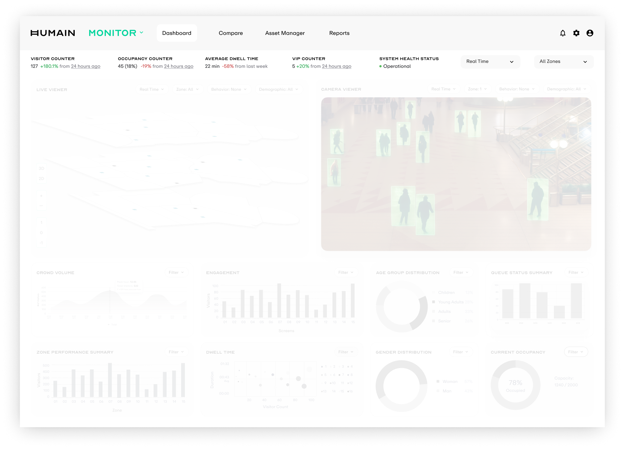
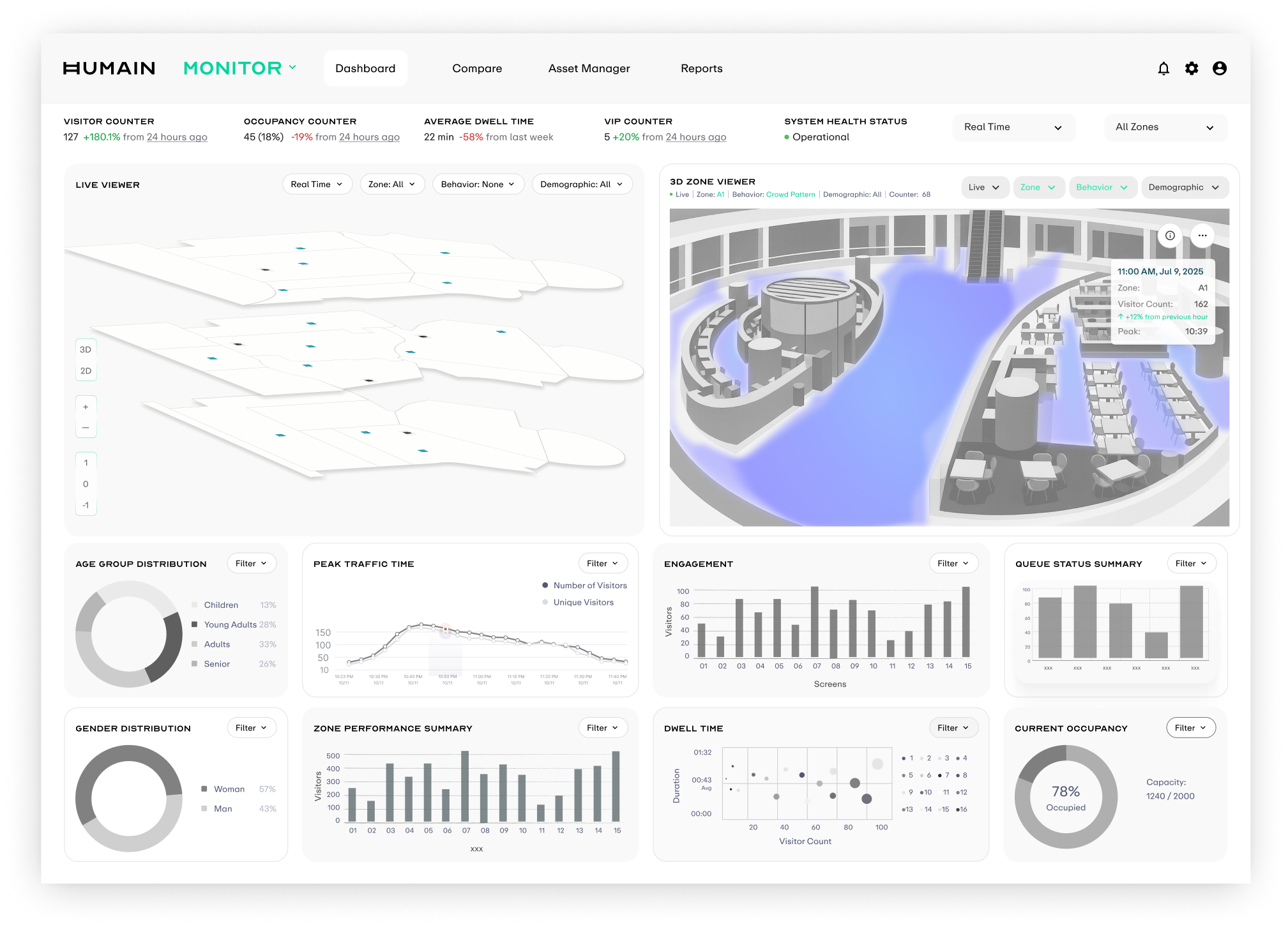
We started from the core question: "what does an operator need to know about what happened today?" This framed the first-pass Dashboard skeleton, structured in three vertical layers: KPI cards at the top for at-a-glance metrics, a 3D Zone Viewer in the middle for spatial density context, and a multi-dimensional data comparison view at the bottom, enabling a quick top-to-bottom scan for full situational awareness.
KPI + Global Controls
The top strip carries the most critical real-time indicators: visitor count, occupancy rate, average dwell time, VIP count, and system health status.
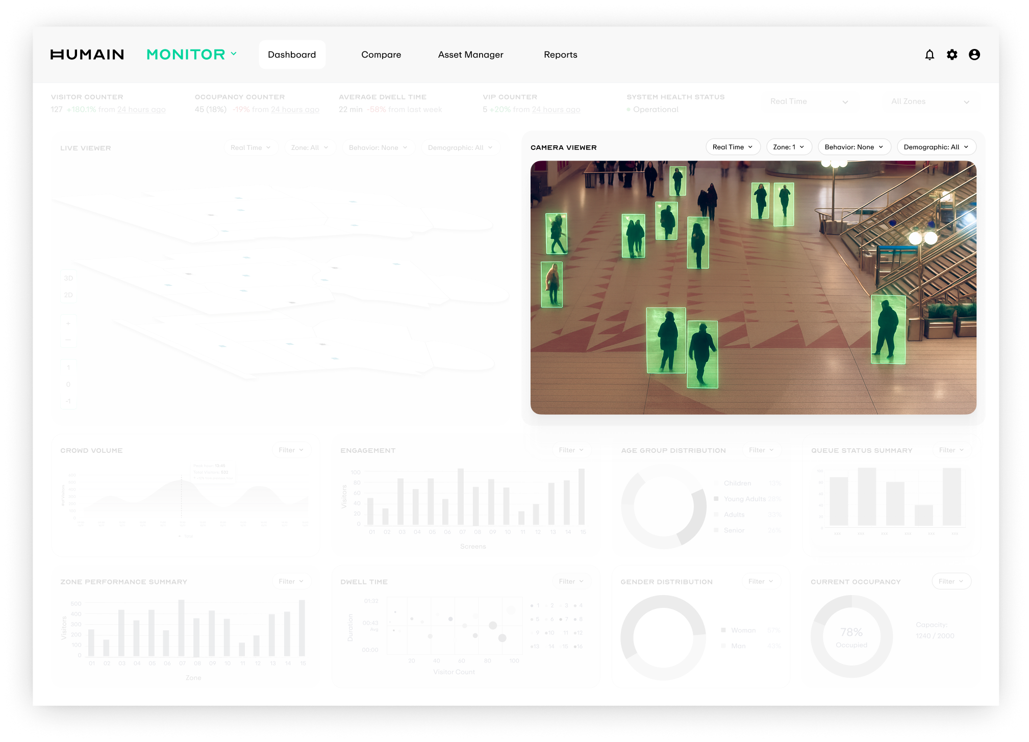
Viewers
The middle band holds two core entry points. Live Viewer renders real-time crowd density with 2D silhouettes, while Camera Viewer overlays AI detection frames onto the camera view.
Statistical Analysis
The bottom section aggregates footfall, dwell time, age and gender distribution, and queue status, providing trend playback and comparison for operational decisions.
CHALLENGE 01: PRIVACY CONSTRAINT
Privacy Constraint
Live footage gave the clearest spatial context, but it created the highest compliance risk. I needed to preserve spatial awareness without exposing real camera feeds.
How might we communicate presence and movement for operational decisions without live camera footage?
EXPLORATION
Around this problem, I quickly explored four visualization directions. Each mapped to a different abstraction level and real-time requirement, then we evaluated them across compliance risk, technical feasibility, and information density.
Silhouette-based rendering
Use silhouettes instead of real human imagery, preserving posture, position, and movement direction while stripping away face and identity cues. Visually, it stayed closest to the original scene.
Frame-by-frame processing put too much pressure on edge compute and bandwidth, so it could not be stabilized for the MVP launch.
Point-based rendering
Simplify every detected person into a glowing point in 3D space. Operators can read crowd dynamics with minimal visual elements.
The MVP could not guarantee stable calibration and tracking across multiple cameras; points would drift and jump.
Live heatmap updates
Overlay a live-updating heatmap onto the 3D scene so crowd density can be judged directly in spatial context.
The MVP data pipeline only produced processed density results over time windows, so it could not support a continuously flowing heat surface.
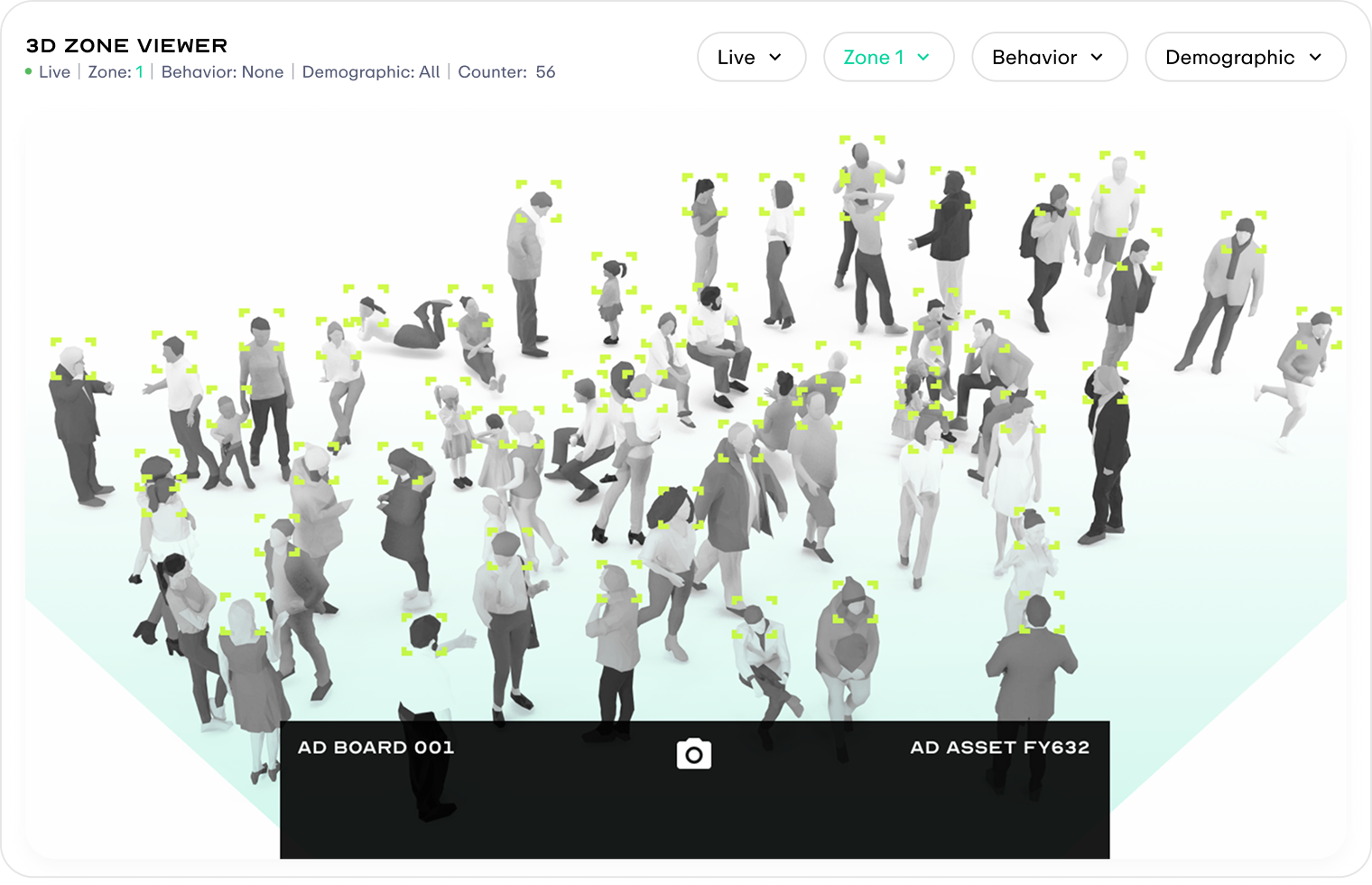
Aggregated density for a time window
Project density data from a time window onto a static grey 3D scene as soft color blocks, with hover cards showing visitor count and peak time for that zone and period.
This matched the privacy-by-design approach and the existing batch + time window data pipeline, making it the most reasonable MVP tradeoff.
SOLUTION
The final solution is a privacy-safe 3D Zone Viewer that separates the two information layers of "space" and "behaviour". It preserves the compliance baseline, matches what the MVP engineering pipeline can realistically deliver, and leaves a clear upgrade path for the next scope.
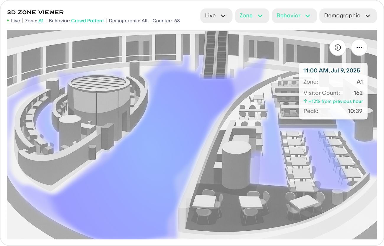
Aggregated density for a time window
MVP solution. Grey 3D scene + time-window aggregated density, with no live footage, no faces, and no individual traces.
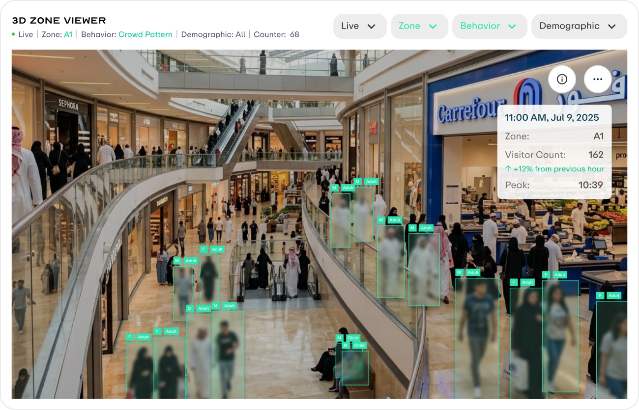
Future Version
Next-stage solution. Real footage with face blurring, plus age and gender labels to balance privacy compliance with scene readability.
CHALLENGE 02: PRIORITY SHIFT
Priority Shift
The MVP refocused around a single outdoor advertising operator. Every viewer and data visualization needed to be reprioritized around decisions about ad placement performance.
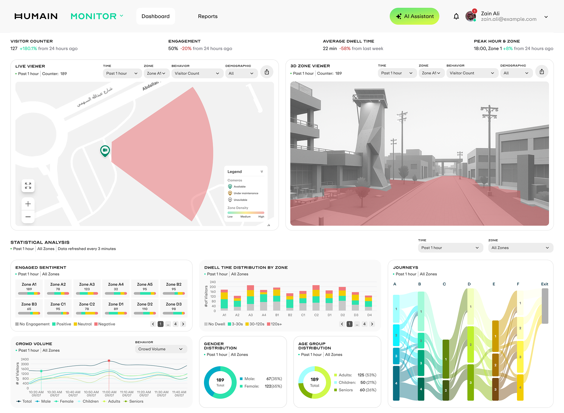
From Indoor Monitoring to Outdoor Advertising
The viewer moved from an indoor 2D layered scene to an outdoor 3D Zone Viewer. KPIs were simplified around average dwell and peak time windows. Journeys introduced a Sankey view for cross-zone movement, while Age Group Distribution moved into the primary view to support decisions across ad placement, audience, and time period.
 After
After 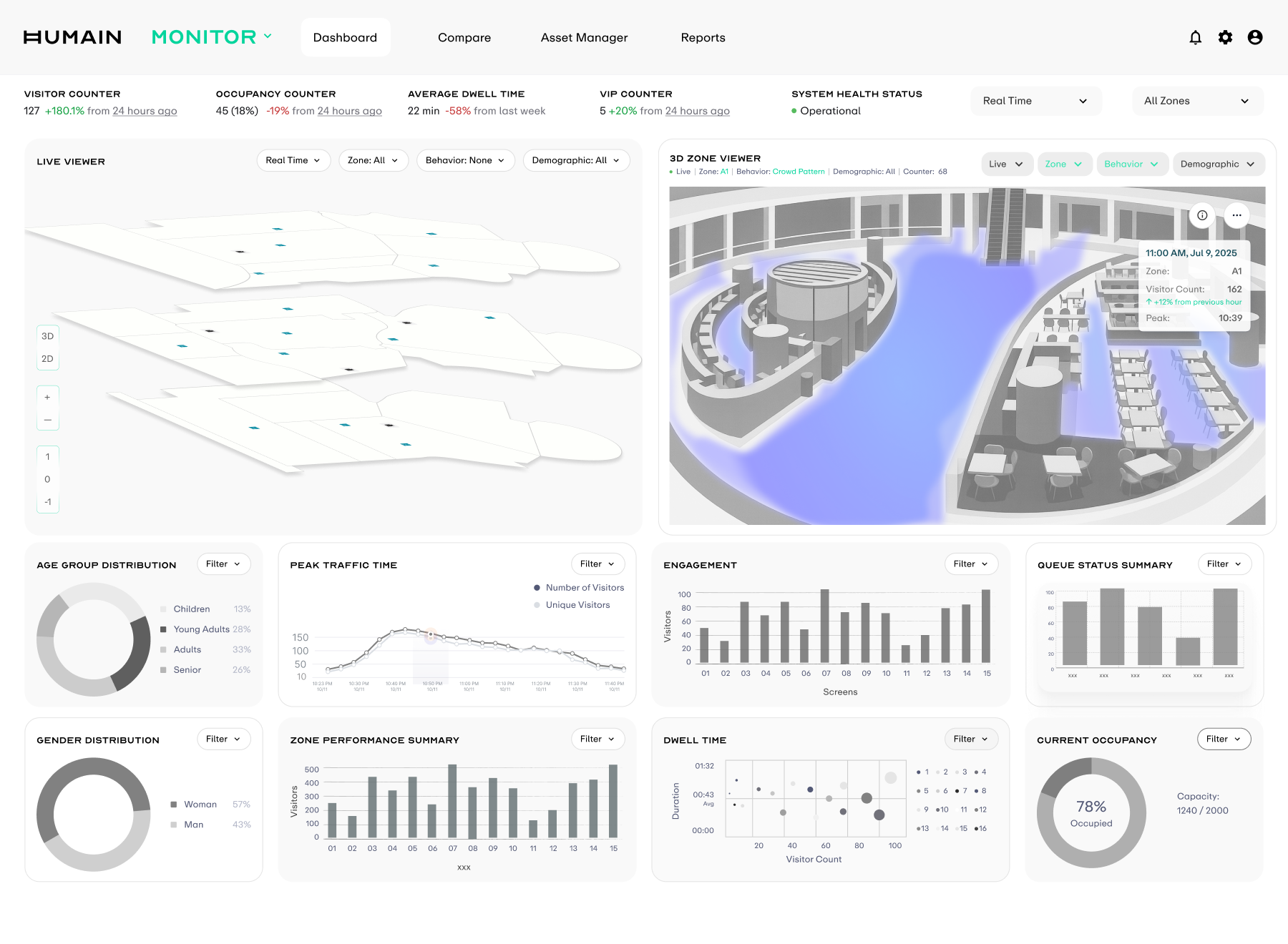 Before
 MVP Design Solution
A dashboard for outdoor advertising operators that turns raw camera signals into metrics directly usable for ad placement pricing and campaign decisions. The screen is structured into three layers: top KPIs, two viewers, and Statistical Analysis below, covering the full chain from on-site sensing to performance attribution while keeping every component in the same filter context.
DASHBOARD
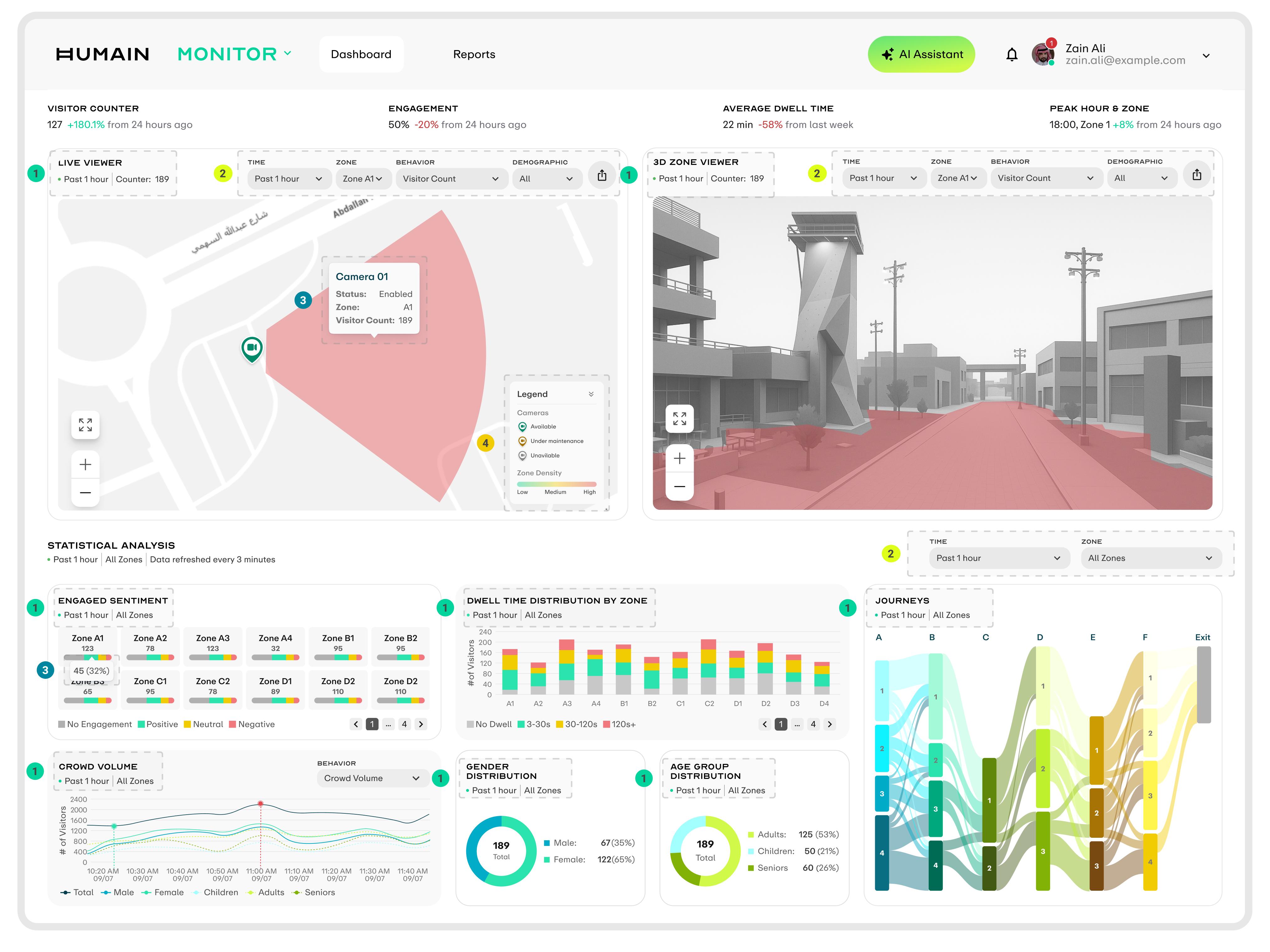
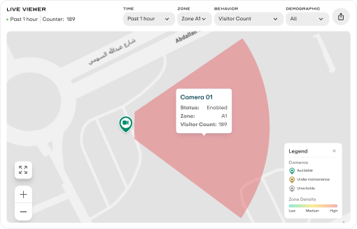
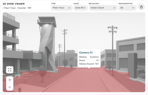
Component Header
Each component uses a consistent top-left header made of the component name and one line of context, making the time window and zone scope clear.
Filter Controls
Viewer and Statistical Analysis have independent filters that control their own data scope, allowing cross-comparison within the same screen.
Hover Tooltip
Every interactive element shows a tooltip on hover, using the same key-value structure while adapting content to each component type.
Legend
Live Viewer includes a collapsible legend that explains icon semantics and color gradients. It can collapse into one title row and expand on click.
Viewer Metric Switching
Live Viewer and 3D Zone Viewer share the same behavior and demographic dimensions. When users select a metric on the left, both viewers switch to the corresponding visualization state at the same time, keeping the side-by-side comparison context aligned.
BEHAVIOR
DEMOGRAPHIC
STATISTICAL ANALYSIS VISUALIZATIONS
The five components form the full decision chain for outdoor advertising: audience mix, sentiment feedback, time-period distribution, dwell quality, and cross-zone movement. Each component supports both All Zones comparison and Single Zone drilldown, carrying two analysis perspectives in one model.
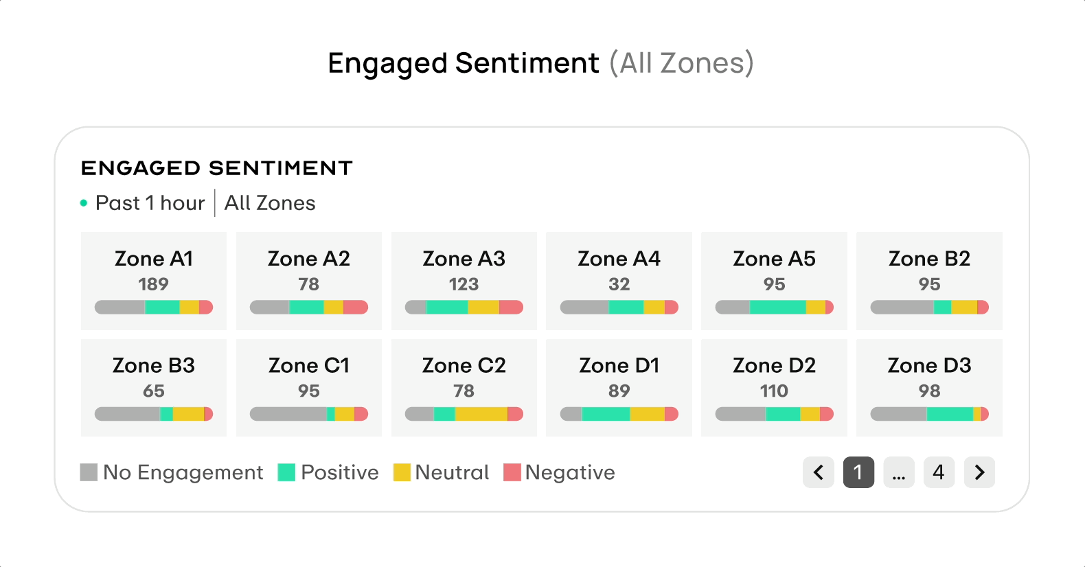
Each zone is represented as a card, with the pill bar filled by four engagement levels.
Interaction In Global Selector All Zones view, each zone is represented as a card and the pill bar is filled by four sentiment ratios. Hover opens details; switching to a single zone replaces it with a treemap where area directly shows sentiment share.
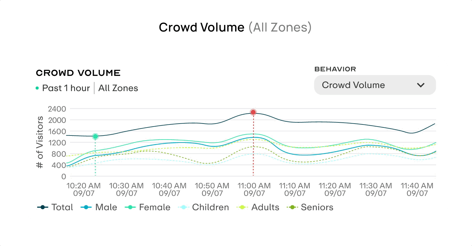
Shows crowd volume curves for the selected time range, with the Total line supported by gender and age-group lines.
Interaction Hovering over the curve syncs a vertical guideline across all line values, and the green cursor can be dragged. The Behavior dropdown in the top right switches to Dwell Time mode.
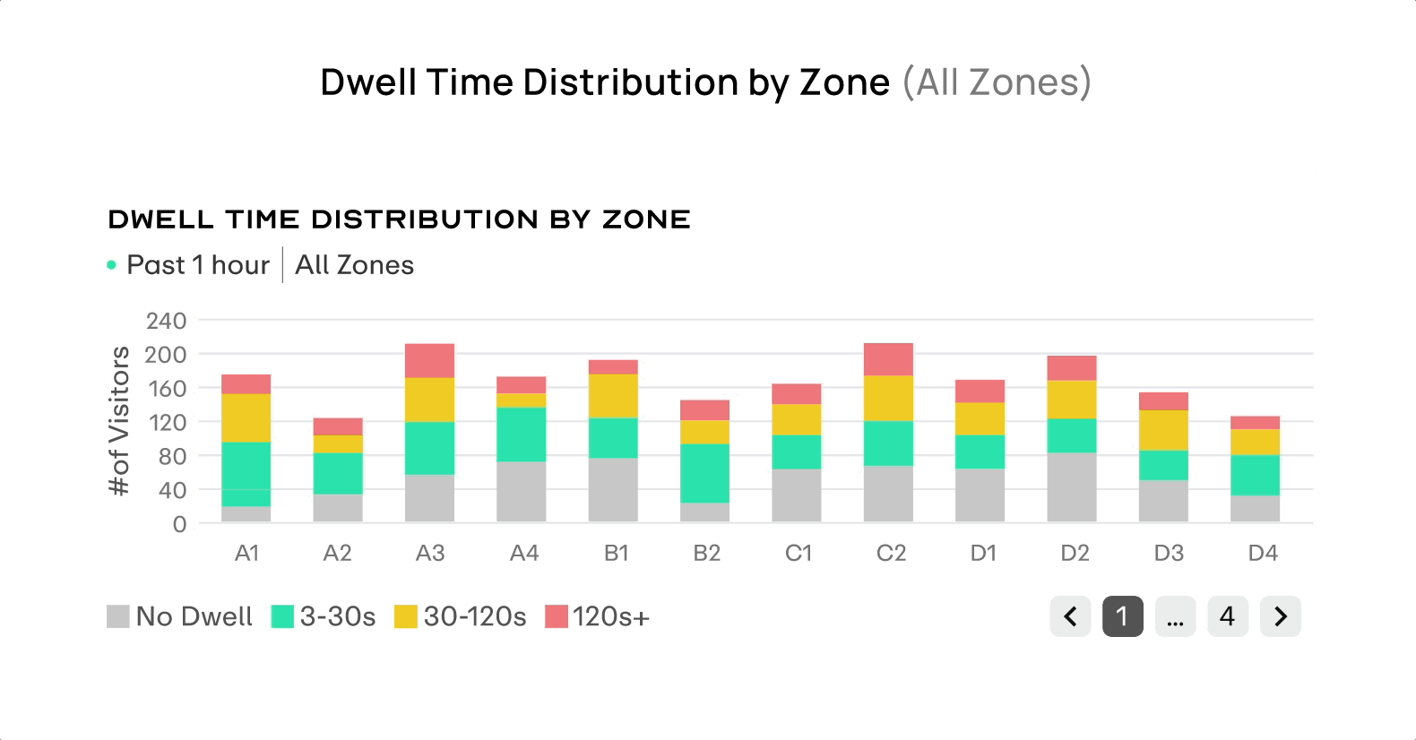
In All Zones view, each bar is stacked by dwell-time range.
Interaction Hover reveals segment details, supporting cross-zone comparison of deep dwell. Switching to a single zone replaces the chart with a treemap and adds the Avg. Dwell Time metric at the top.
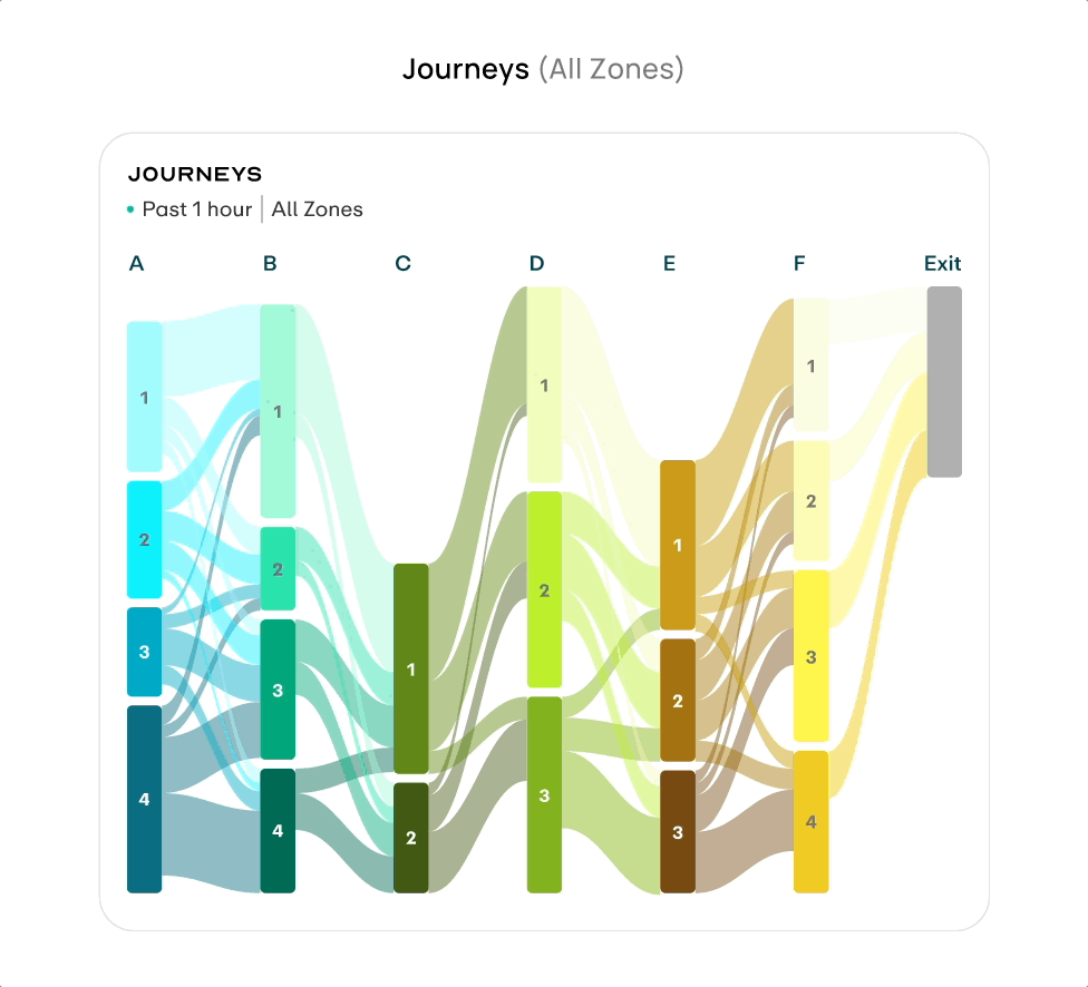
The Sankey diagram shows the complete cross-zone movement path, with band width representing visitor count.
Interaction Hover highlights a single path and shows its share. Switching to a single zone redraws the flow from that zone as the starting point.
The Demographic component uses donut charts to show the audience mix for Age Group / Gender.
Interaction It supports both All Zones distribution and Single Zone drilldown. Hover shows exact visitor counts and share, helping operators judge whether the current audience matches the advertising target.
Build a design system for Humain
As the brand moved from Scai to Humain and engineering migrated to Tailwind, the old component library could no longer be reused in naming, structure, or implementation. I started by auditing the legacy system, then redefined the token architecture, foundational components, and documentation standards so design and engineering could work from the same language.
AUDIT & PREPARATION
The first step was to clarify the gap between the old system and the new inputs. I audited the legacy SCAI component library by usage frequency, visual consistency, and token binding, identifying what could be reused and what needed to be replaced. At the same time, I received the Humain brand guideline, which became the starting point for the new design system's color, typography, and brand expression.
Tailwind Alignment
After engineering decided to migrate to Tailwind, its technical framework directly constrained the design-side decision space. Before designing, I clarified those constraints and aligned with frontend across three layers: tokens, layout, and components, so every subsequent design decision stayed within the same boundary.
TOKEN LAYER
Figma variables fully aligned with Tailwind config
The structure followed tailwind.config.js. Spacing used the 4px baseline, while colors were abstracted into semantic tokens and mapped back to the Tailwind palette scale.
LAYOUT LAYER
Using Tailwind's default breakpoints
The system used sm, md, lg, xl, 2xl, container widths, max-width, and gap values aligned to Tailwind's default scale.
COMPONENT LAYER
Tailwind's utility-first model
Only properties that affected both structure and accessibility became props; variant, size, and disabled states stayed inside the component.
FOUNDATIONS
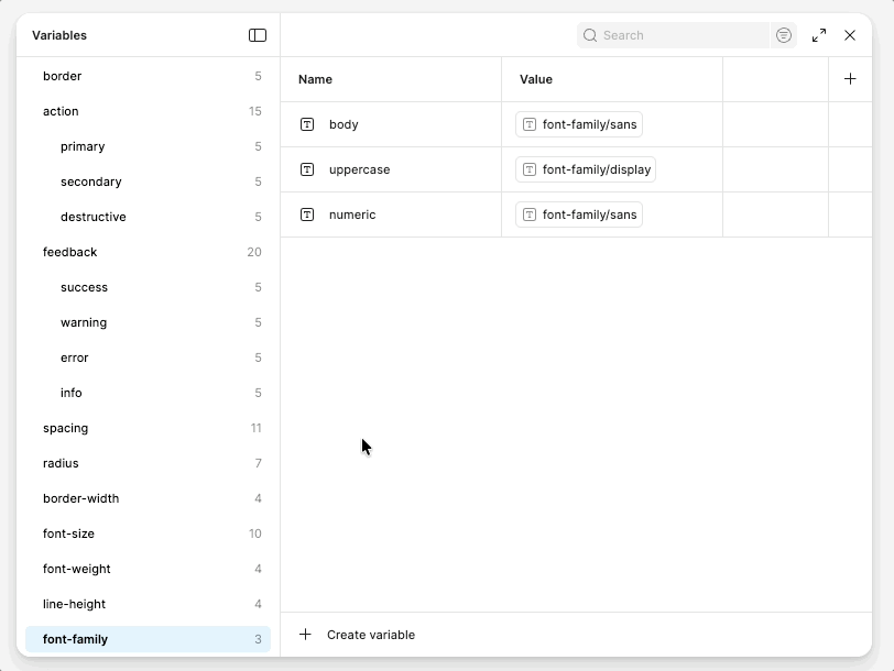
Foundations are the base layer of the system, and every component pulls values from here. I organized them into Color, Typography, Spacing, and Radius, with tokens at the center of each group. Tokens are split into Primitive and Semantic layers: components only reference semantic tokens, so theme switching only requires changing the middle mapping layer.
Variable Mapping
The variable grouping structure directly mirrors tailwind.config.js, so design and code share the same naming system.
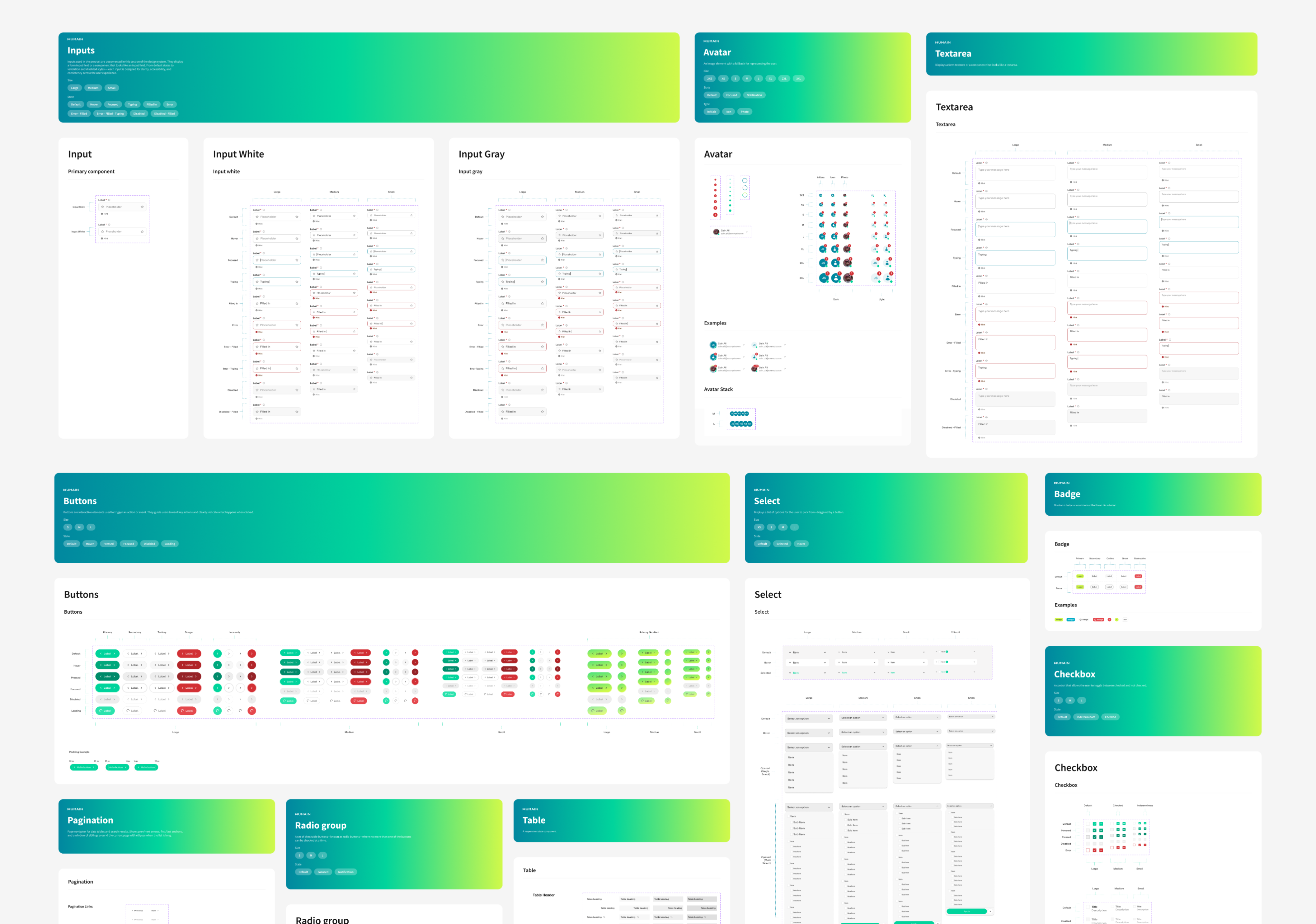
COMPONENTS & MODULES
After the Foundations were defined, I started by building atomic components. Each component was expanded by variant and state. Once the components were stable, I began assembling them into Modules. Data visualization modules were the focus; each one covered Default, Loading, and Error states. Other page-level modules were packaged separately according to their own business scenarios.
DOCUMENTATION
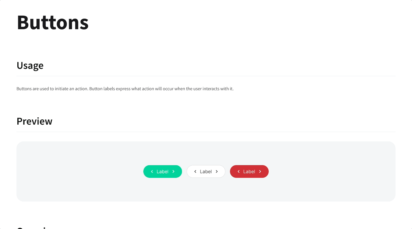
Each component in Figma includes usage documentation covering use cases, available props, state descriptions, and do/don't examples.
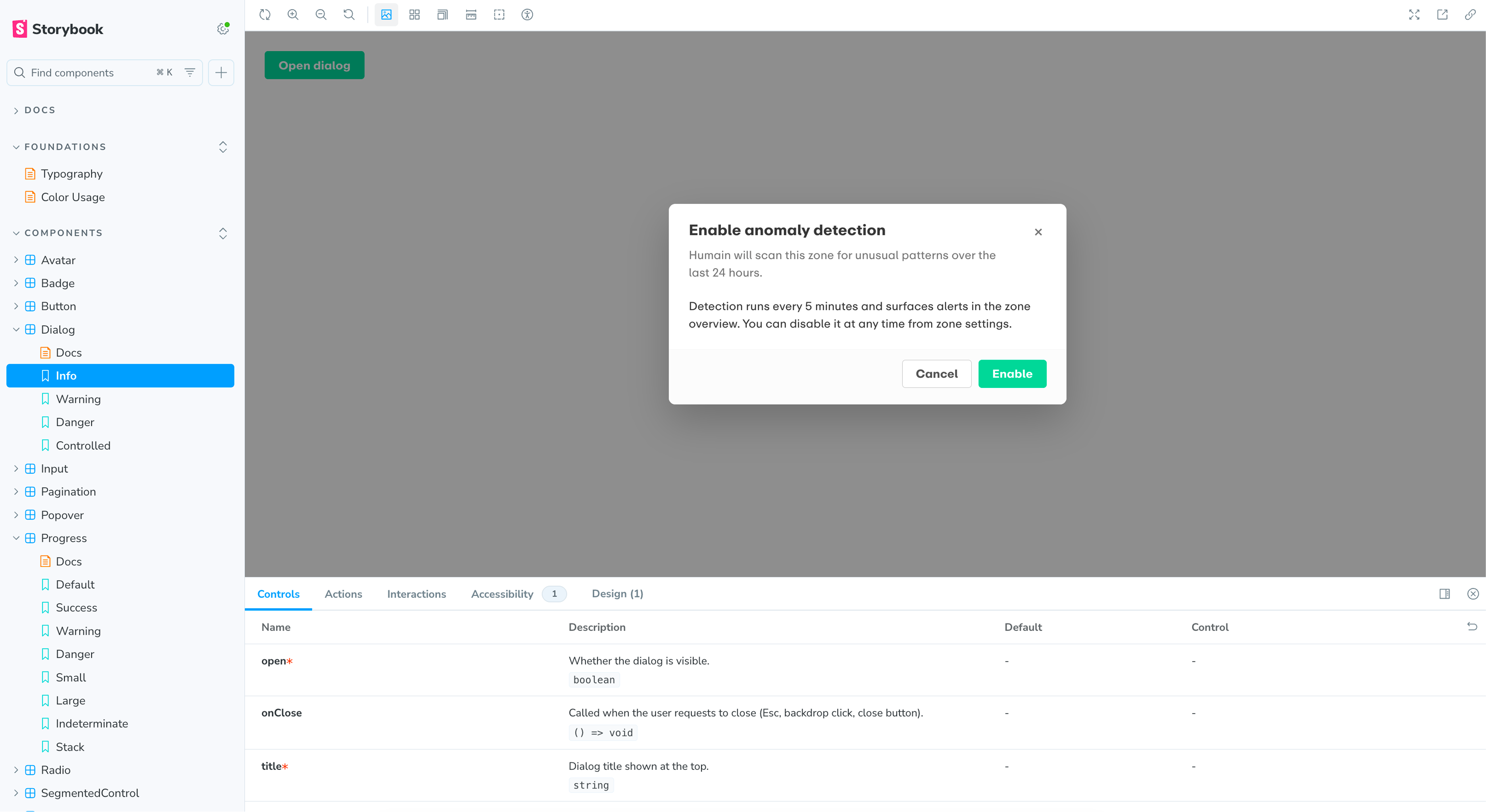
STORYBOOK
The code implementation of each component is hosted in Storybook, where developers can inspect how each variant and state renders, adjust parameters, and reference the props API. Figma documentation and Storybook link to each other, giving design and engineering the same source of truth.
Results
As the only designer, I led Humain Monitor from research and IA to a production-ready dashboard and design system. Built on Shadcn + Tailwind, the system aligned Figma variables with tailwind.config.js and gave the team reusable Storybook documentation.
The product helped secure its first commercial contract with a leading Saudi outdoor advertising operator across multiple Riyadh complexes, validating the focus on actionable AI insight over passive data display.
REFLECTION
The main process shift was designing one sprint ahead: define enough for engineering to move, while leaving lower-risk details for the next iteration.
Tailwind became a shared design language. Mirroring its structure in Figma made the system easier to maintain because design decisions stayed close to implementation.
Next time, I would test the IA earlier with venue operations and security users, and reserve dark mode and accessibility tokens from the start.
Discy.ai
Have a nice project?
Hi, my name is . You can answer me on this email . I am looking for help with a .
Scan on another device