THEME 1
Core Flows Are Excessively Complex
Login failures and Card Reader dependency push core task paths far beyond industry standards

Scan to add me on WeChat
INCORRECT PASSWORD. PLEASE TRY AGAIN.
AIB Mobile 4.0 · Everyday Money Experience Design

AIB is facing competitive pressure from mobile-first challengers like Revolut and Monzo. This joint AIB-Globant initiative aimed to define the MVE for Mobile 4.0. The project was structured across three layers: Programme for strategic direction, Experience Design for solution definition, and Implementation Squad for development. I worked within the Experience Design layer, collaborating with service designers, researchers, content strategists, and the design system team, responsible for one scenario end-to-end, from conceptualisation through high-fidelity iteration.
The delivered solution received board approval and provided the design foundation for AIB's subsequent product iterations and UI component library.
Willing to use Savings Spaces and Spending Insights, validating core design direction.
Would migrate from Revolut back to AIB if these features were delivered.
Allied Irish Banks (AIB) is one of Ireland's largest financial institutions, serving millions of personal and business customers. Its mobile banking app has become a key entry point for daily financial management, with over 1 million downloads on Google Play.
Despite its large user base, AIB faces threats from mobile-first competitors such as Starling Bank, Revolut, and Monzo. These new players offer seamless digital experiences, while AIB's mobile app remains at an earlier 'Mobile 2.0' stage: fragmented features, complex flows, and an experience rooted in traditional banking system logic - feeling outdated and unappealing to a new generation of users.
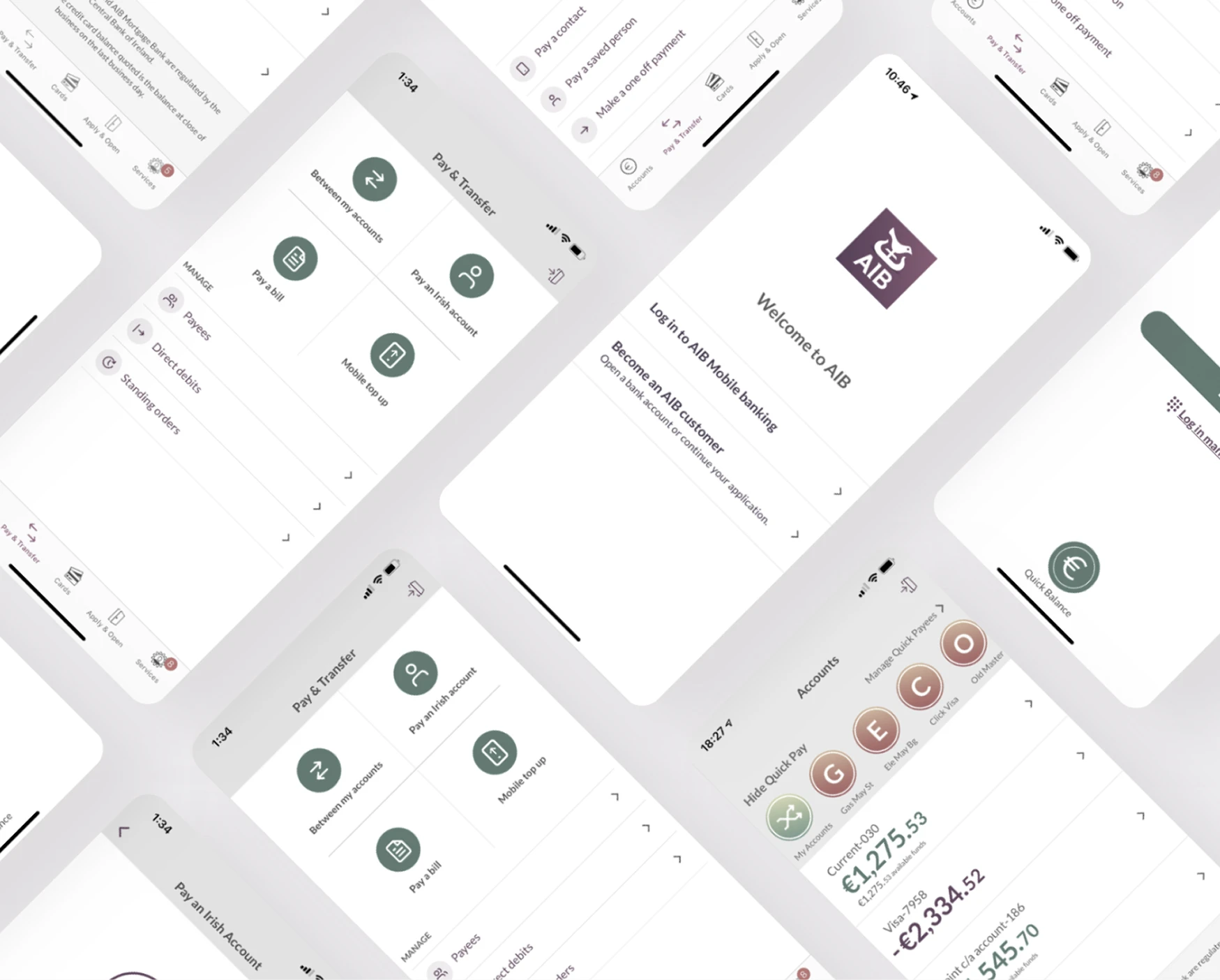
To address this challenge, AIB launched the Mobile 4.0 project in 2024, aiming to redefine the next-generation mobile banking experience and translate the future digital banking vision into an actionable product direction.
When I joined, the project was at the transition from exploration to concept design. My main work was to synthesise existing research outputs, understand core gaps, and confirm the scope of design I was responsible for.
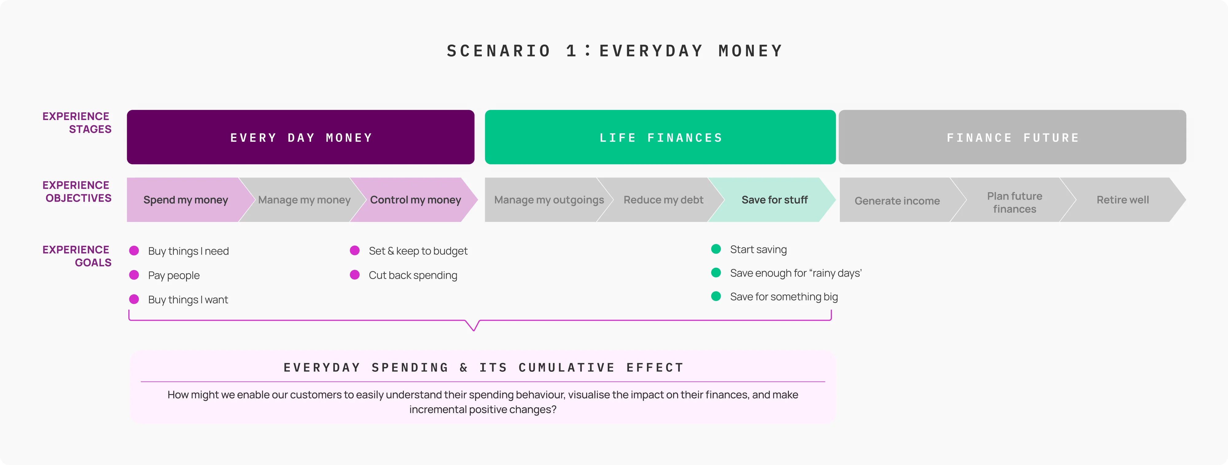
The Globant CX team had already built an experience journey framework for AIB covering three phases: Everyday Money, Life Finances, and Financial Future. The MVP phase focused on the first two phases - addressing the most pressing financial pain points while leaving room for future expansion.
The team broke this down into five core scenarios (Everyday Money, Saving for mortgage debt, Consolidate debt, Customer support, Youth account) and divided ownership. I was responsible for Scenario 1: Everyday Money - the everyday spending experience design.
AIB Universal Journey Framework
Before I joined, the Design Research team had completed an initial round of user research across three channels: customer support records, an online survey, and an existing experience evaluation. Users consistently reported recurring pain points around functional limitations and experience quality. I worked from this raw data to extract key findings relevant to Scenario 1, distilling them into three structural themes as the core input for the design work ahead.
Call centre complaints + online complaints + support tickets
User-expressed needs & competitor perception
UX Audit
Laid out horizontally across 4 CX Map phases (Spend → Control → Manage → Save → Life), with user goals, current actual steps, emotion curve, core pain points, and opportunities annotated in layers. The emotion curve drops continuously from the moment the user opens the app - with no recovery - revealing the complete absence of any 'delight moment' in the user journey. Red tags mark steps with clear breakpoints; blue tags mark relatively usable steps.
Based on the current-state Journey Map analysis and cross-stage pain point comparison, three critical structural problems emerged - together explaining why AIB's current experience consistently generates frustration and churn.
THEME 1
Core Flows Are Excessively Complex
Login failures and Card Reader dependency push core task paths far beyond industry standards
THEME 2
Financial Insight Absent
AIB proactively abandoned this layer - users have already filled the gap with competitors
THEME 3
Savings Tools Missing
Users explicitly expressed wanting goal-based savings and automation rules, but tools are entirely absent
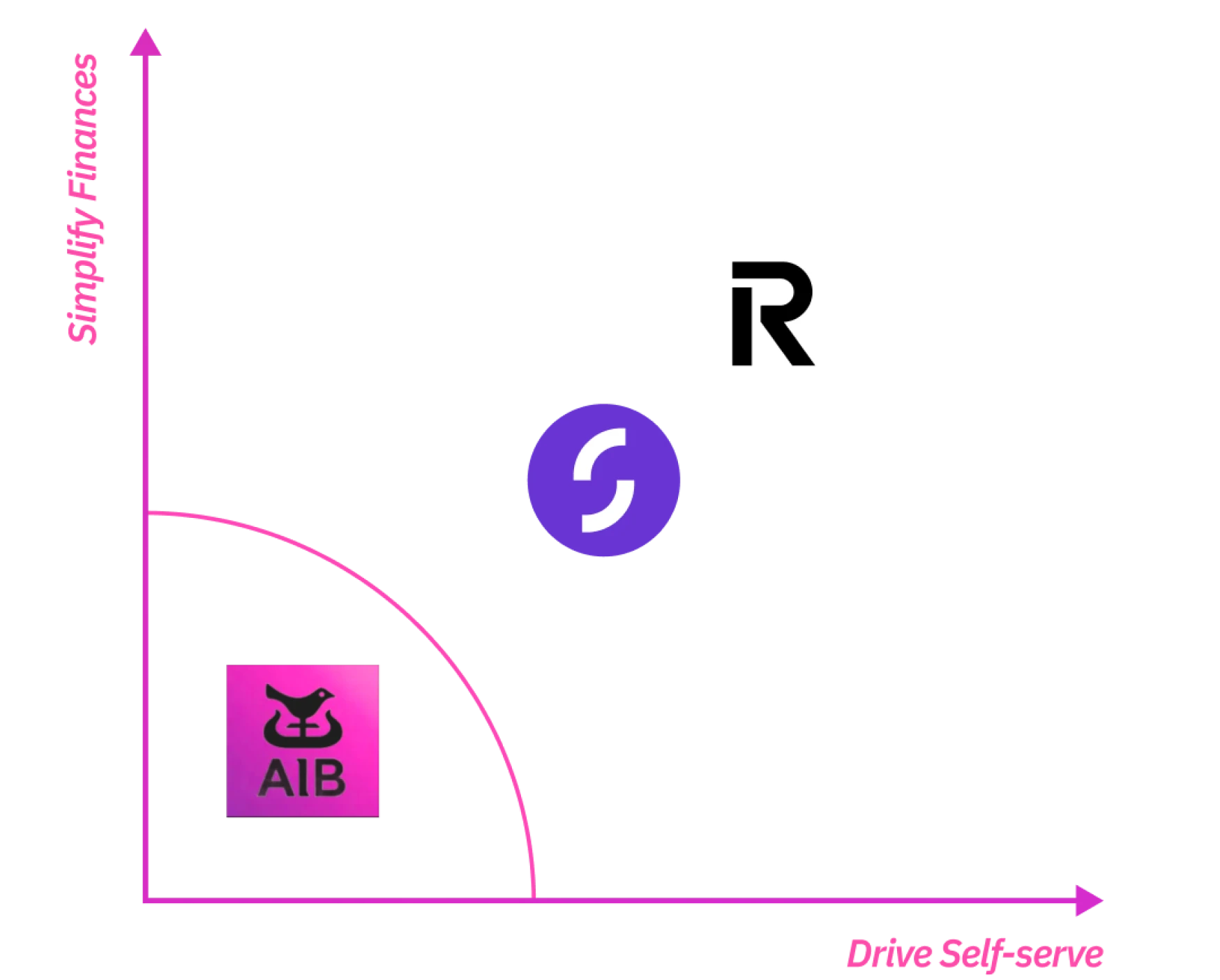
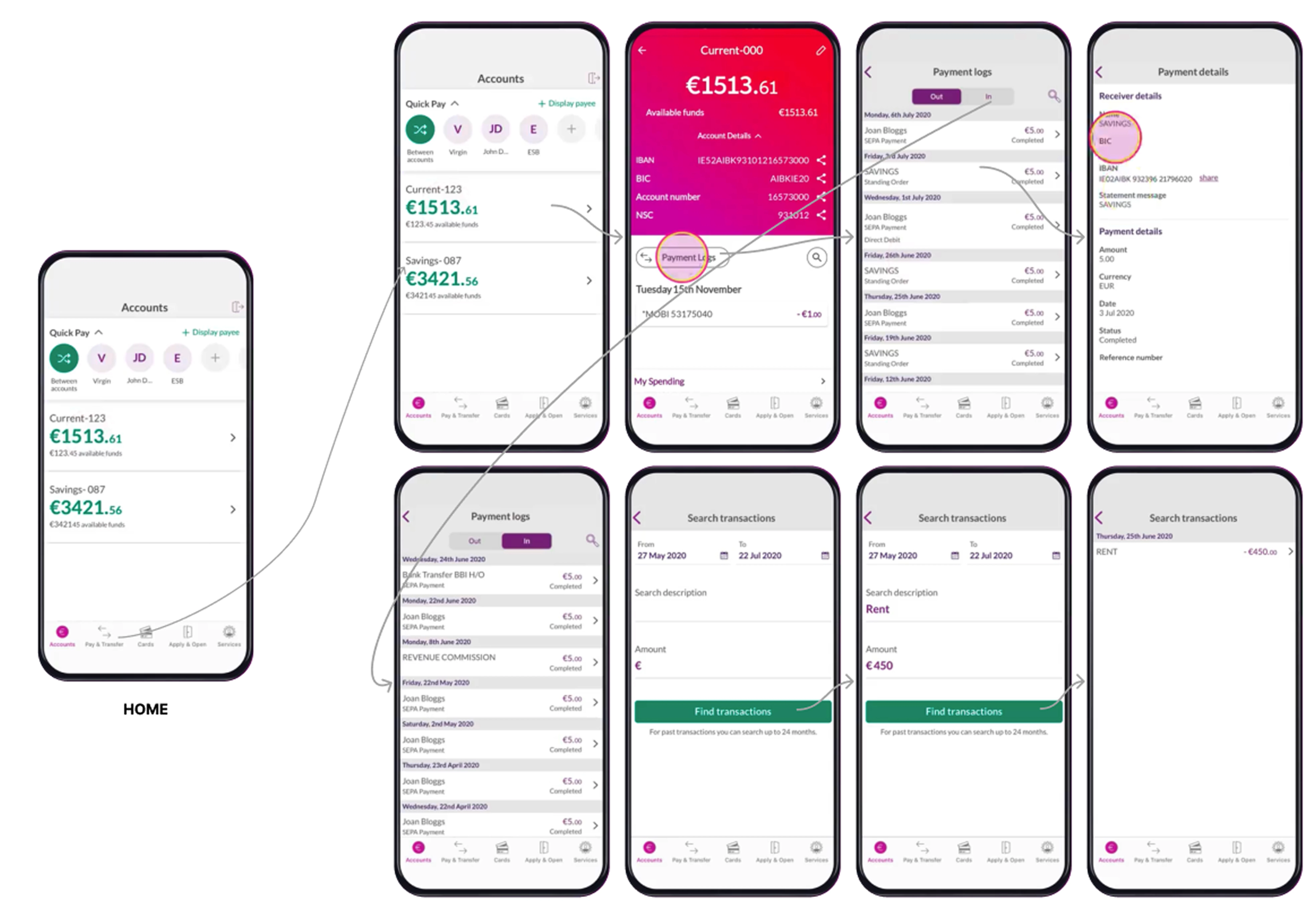
We benchmarked Revolut, Monzo, Starling, and N26 - studying how industry-leading products surface financial information in layers, and how they structure home screens and core interaction flows.
Three common patterns emerged: financial awareness surfaced on the first screen, core actions completed within 5 steps, and savings automation as standard. These three points define users' baseline expectations and point directly to where AIB's current experience most needs to catch up.
Financial Dashboard
All competitors surface "remaining available amount" and "today's / this month's spending" directly on the first screen - users can perceive their financial state the moment they open the app, without entering any sub-page.
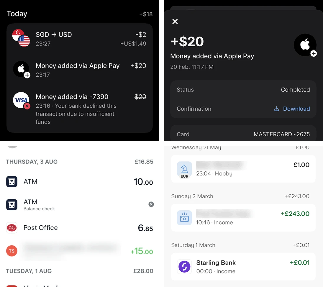
Merchant Logo + Real Name Recognition
Encrypted merchant codes are decoded into real names and brand logos, with transaction status and failure reasons annotated - eliminating user confusion about unfamiliar charges.
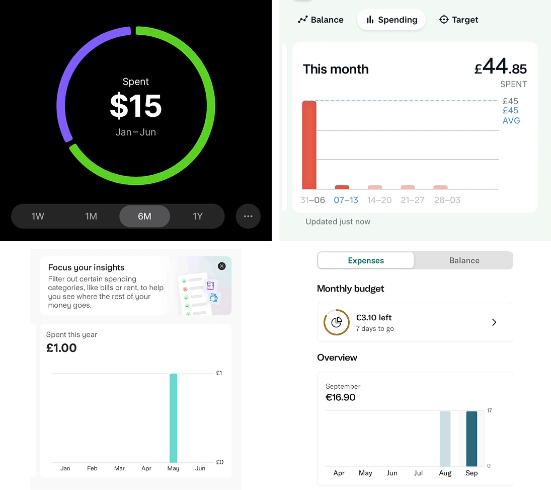
Multi-dimensional spending trends vs. historical
All provide week / month / year time-dimension switching, using historical averages as a reference line - letting users instantly judge whether current spending is high, rather than only seeing absolute amounts.
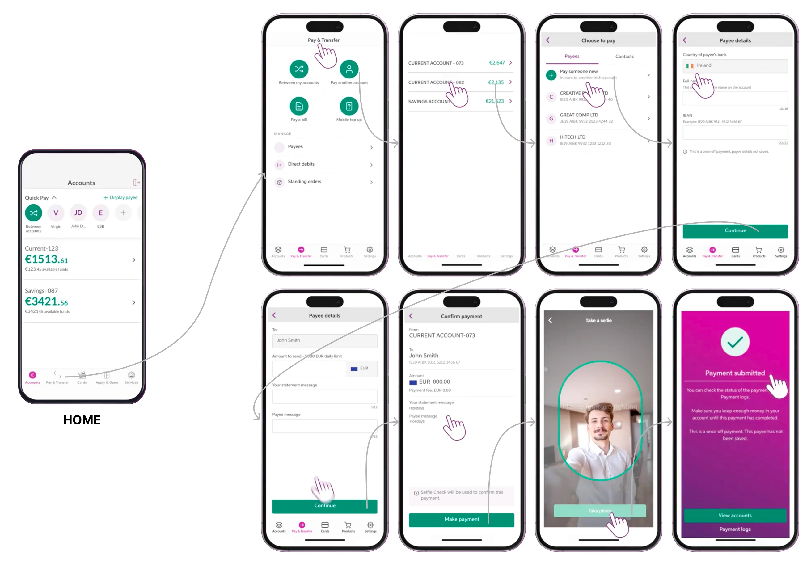
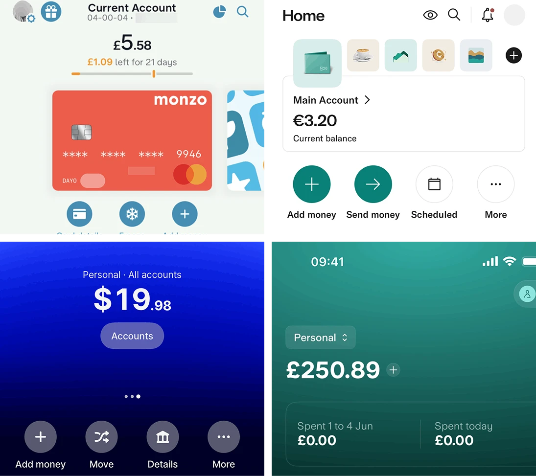
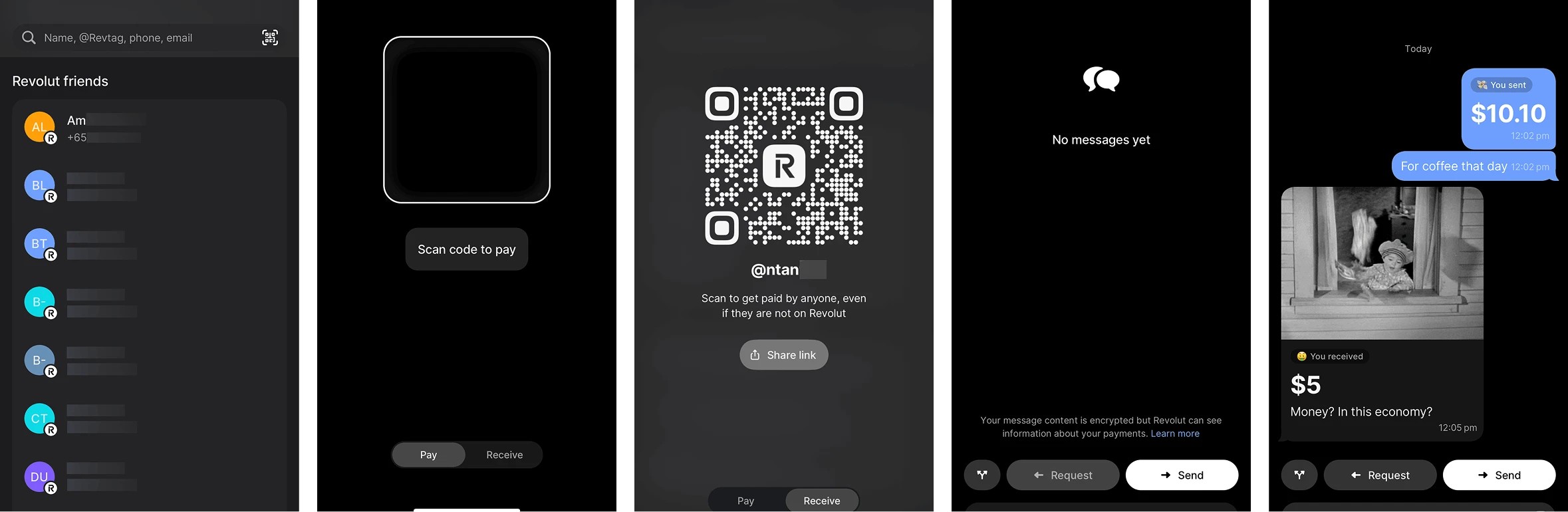
Core transfers completed within 4–5 steps, entirely in-app
Recent contacts pinned to the top, multiple payment channels (contacts / QR code / link / @username) offered in parallel - no need to switch platforms or hardware devices.
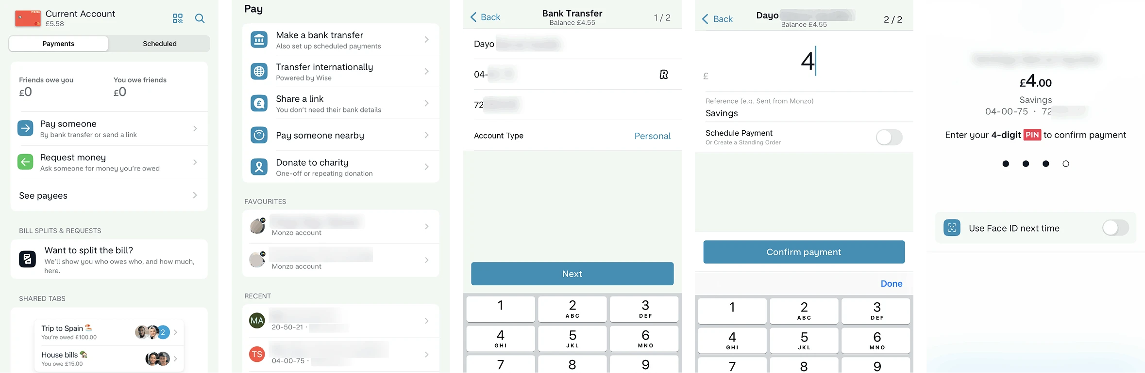
P2P Instant Transfer (Revolut) offers contacts, QR code, @username, and payment link in parallel - making the transfer experience feel as everyday as sending a message.
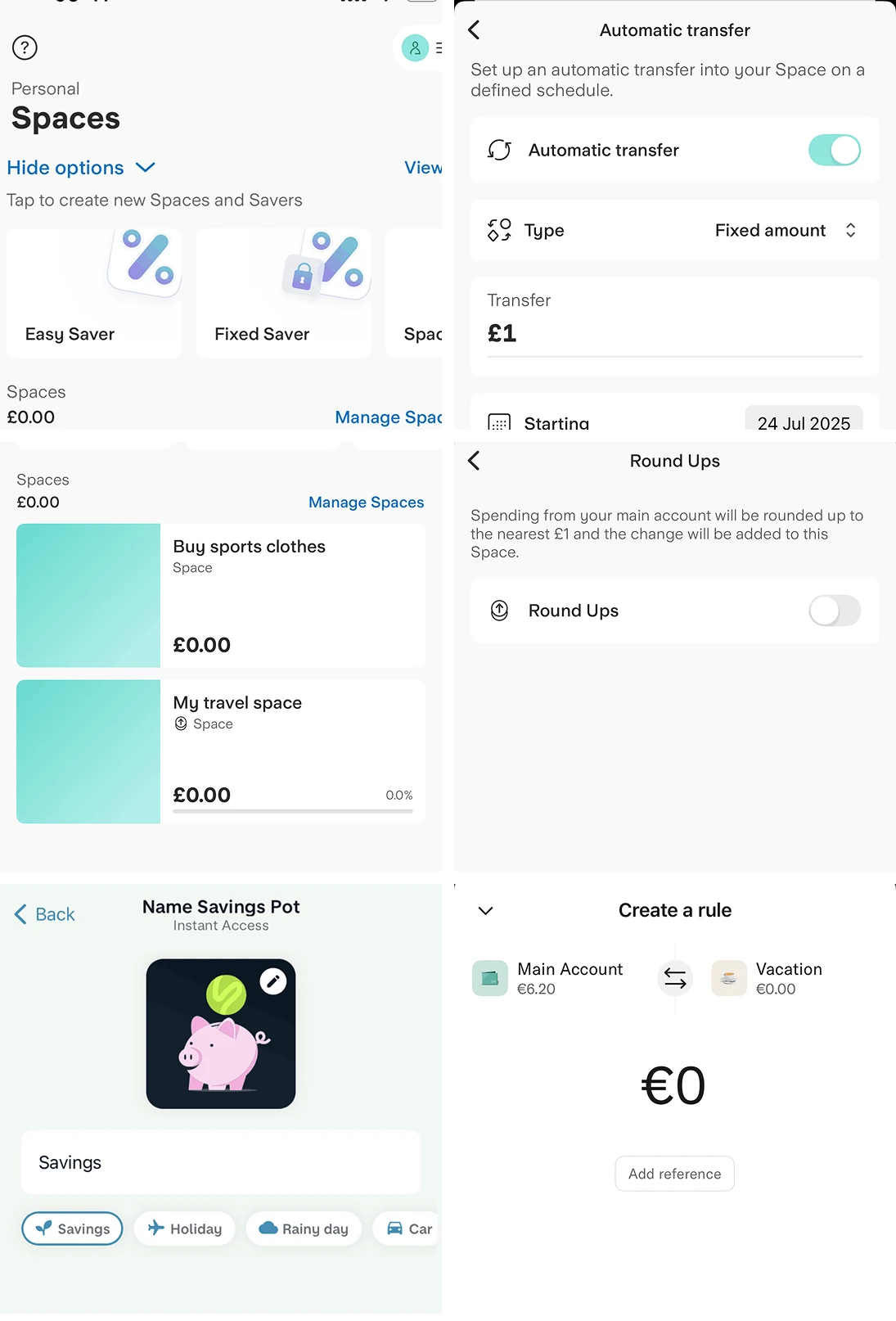
A complete savings behaviour system
Pots/Spaces create mental accounts, Round-up automatically accumulates spare change, Rules trigger savings on conditions, Lock constrains withdrawals until a deadline - together converting savings intent into sustainable habit.
1 Define Persona
Extract representative user types from research data
2 Build Narrative
Set specific contexts and trigger events for the persona, letting behaviour unfold naturally
3 Map Touchpoints
Map each behaviour in the narrative to product features and UI validation
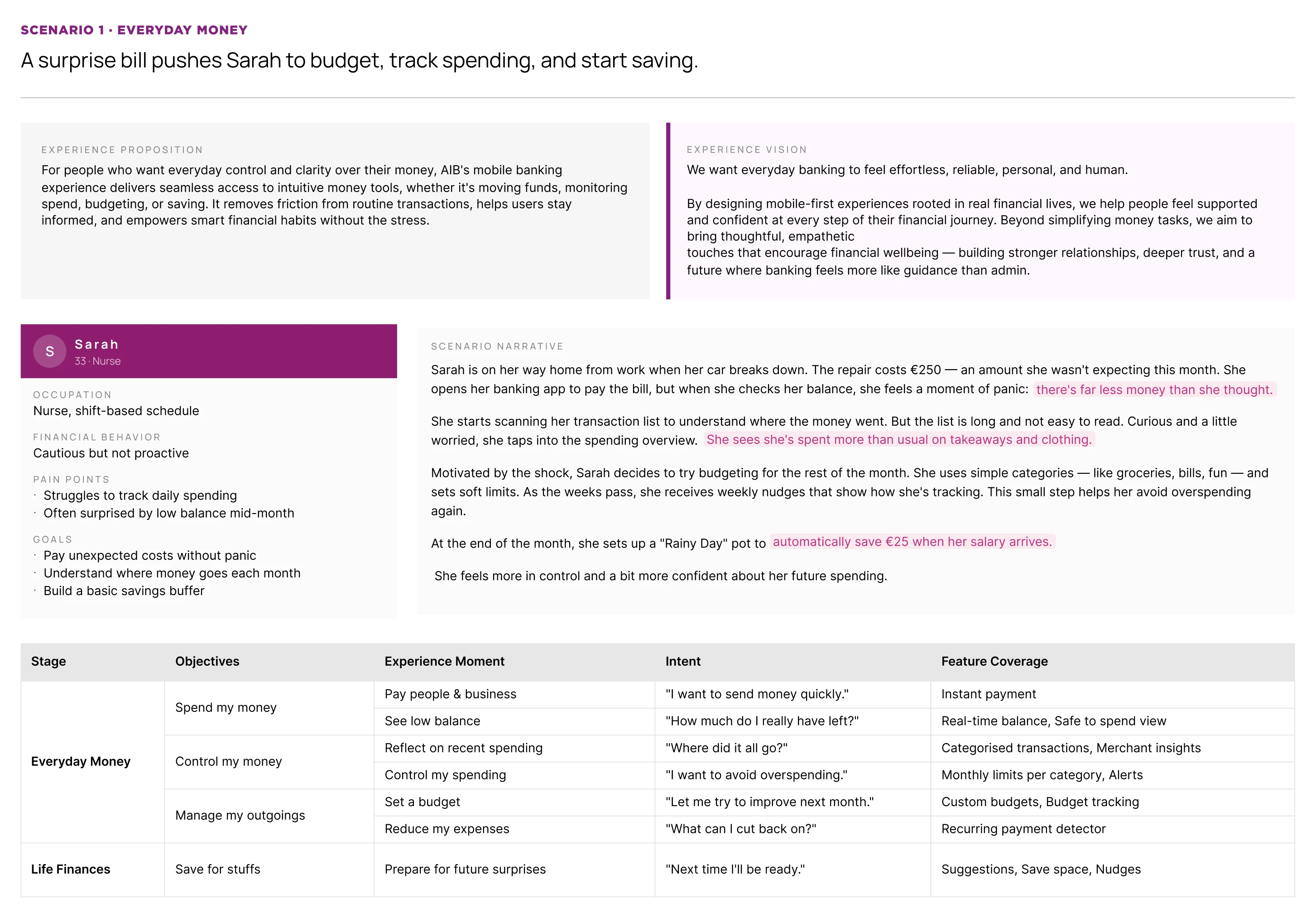
The service designer first defined target persona types and scenario narrative directions based on research data, covering the Spend → Control → Save experience phases. We then worked together to identify the feature capabilities each narrative node needed to validate.
Research revealed a recurring user type: has savings intent but lacks spending insights and tools, reacting with anxiety to unexpected expenses. We built the persona Sarah, 33, a nurse with stable income but no bandwidth for financial details.
The scenario follows: pay a bill → view spending analysis → set a budget → set up auto-saving, connecting Spend → Control → Save. A sudden €250 car repair bill triggers Sarah's shift from passive checking to active management. We chose this trigger because "mid-month surprise at low balance" and "not knowing where money went" were the top two pain points in research.
Everyday Finance Scenario Script: Sarah's Unexpected Expense
I broke down the narrative into specific behaviour steps and feature UI touchpoints.
Behaviour Breakdown: First, Sarah's "unexpected expense" story was broken down into detailed behaviour modules, clarifying her thoughts and actions at each stage of the crisis.
Touchpoint Mapping: These behaviours were then mapped to specific UI touchpoints, ensuring product logic directly responds to her evolving financial intent.
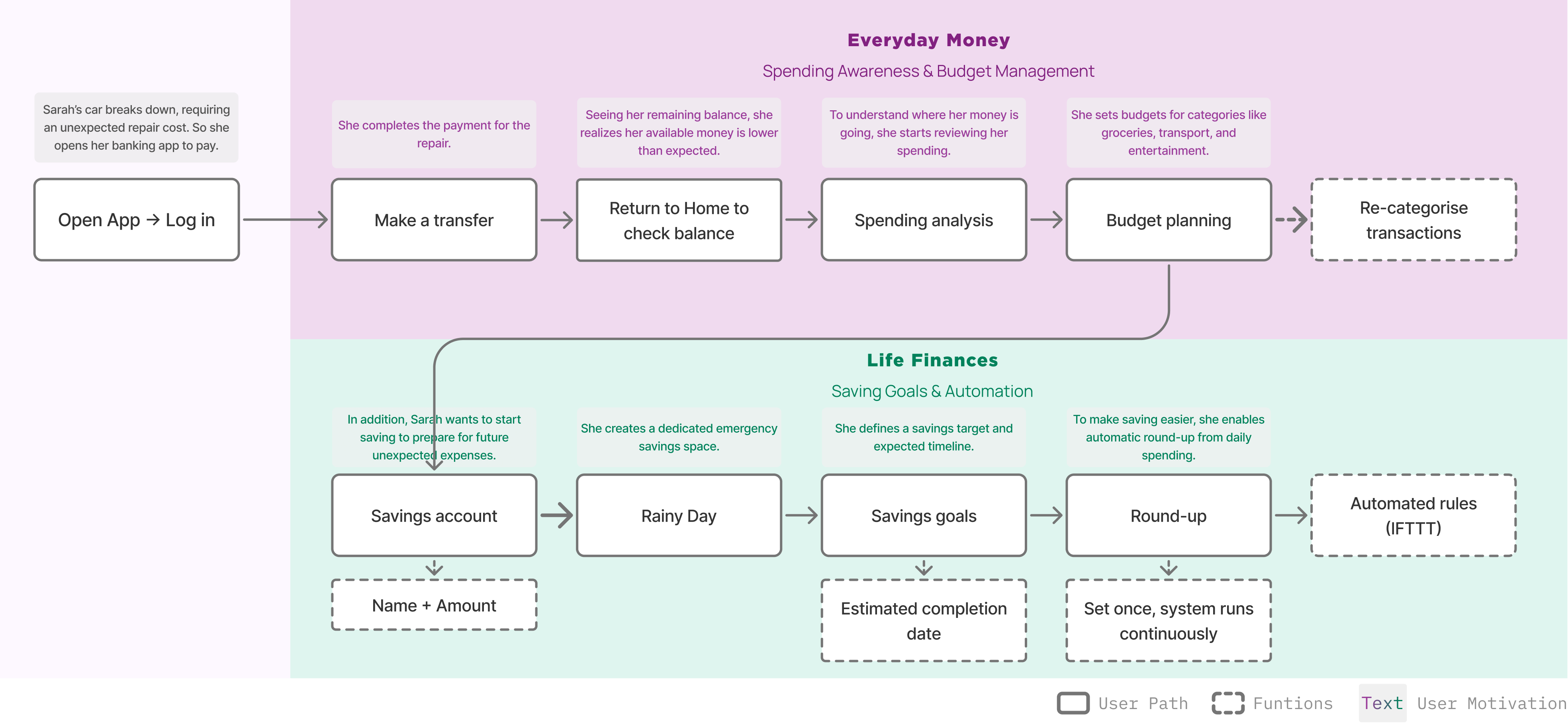
Everyday Finance Scenario Script: Sarah's Unexpected Expense
How might we help users in everyday spending scenarios complete payments frictionlessly, perceive their financial state in real time, and build sustainable saving habits without adding cognitive load?
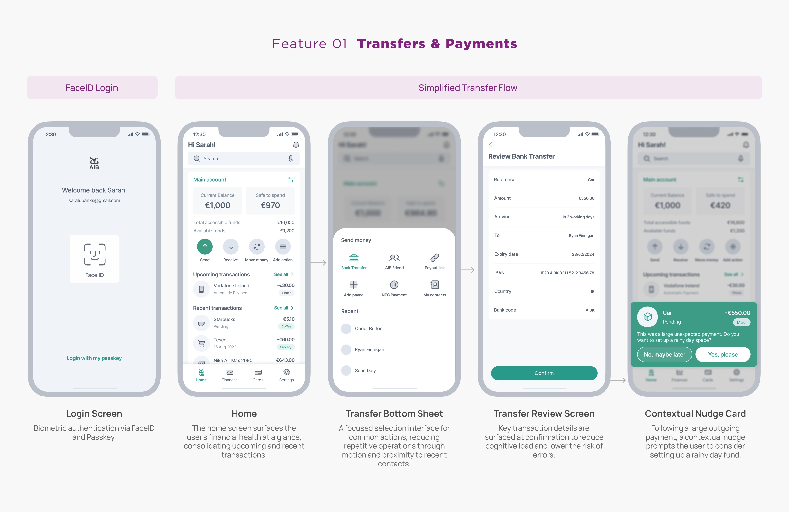
Users can complete payments and transfers quickly - frictionless login, core actions within one screen, recent contacts pinned to reduce repeated steps
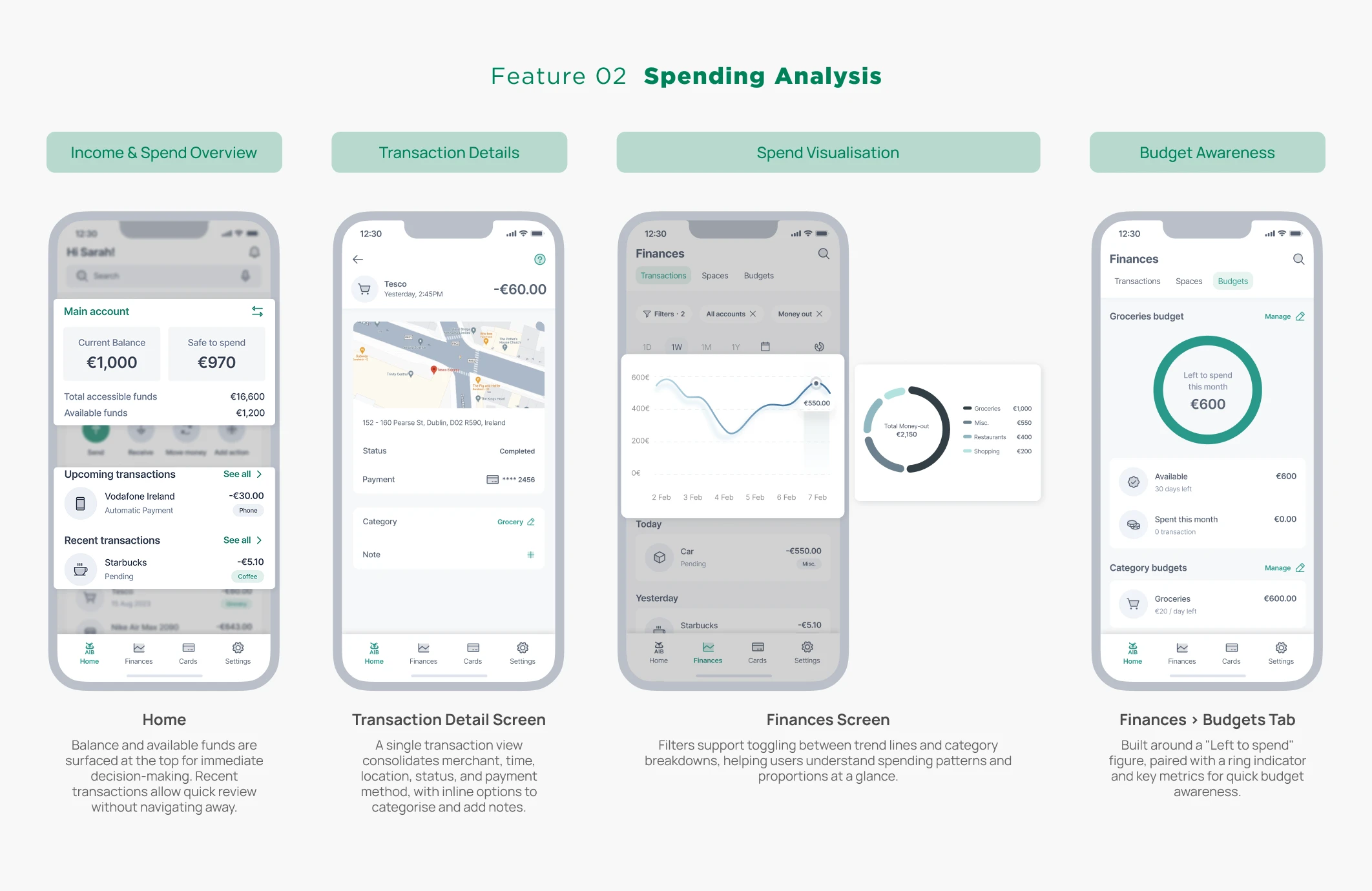
Users perceive their spending state from the very first screen - knowing where their money went, how much they can still spend, and making adjustments through proactive insights
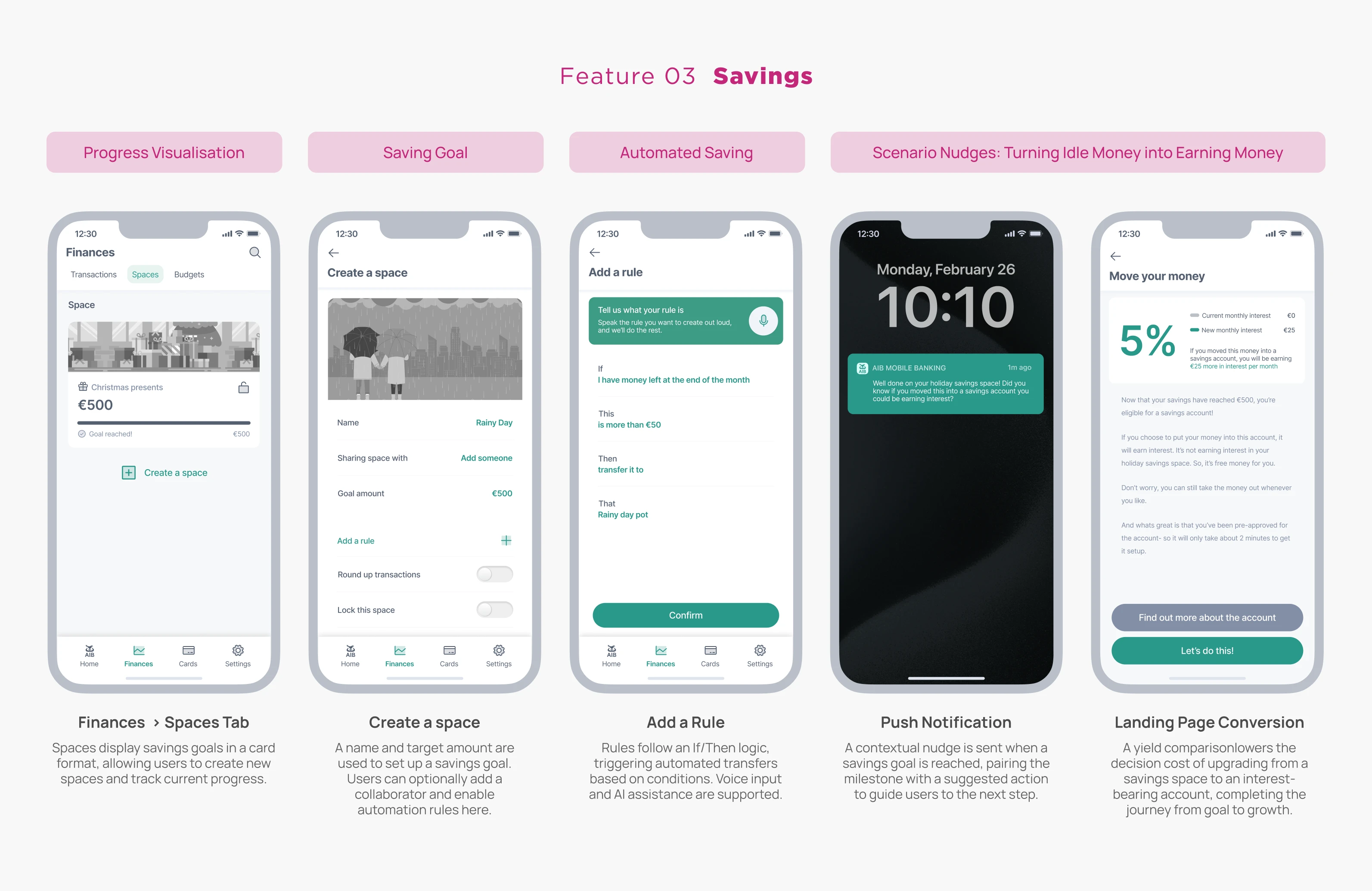
Users set goal-based savings, reducing execution effort through automation; milestone nudges guide funds toward more suitable long-term savings products.
Lo-fi wireframe prototypes were built around 3 themes to validate key interaction flows and visual language. Click a category on the left or scroll the mouse wheel within the module to switch views.
To evaluate early concepts and assumptions and uncover behavioural insights, we conducted in-depth scenario-based user interviews with 50+ participants across varying financial situations.
To support the interviews, I worked with another UX designer to build scenario flows using our wireframes, gradually aligning with the research team to ensure consistent test objectives. The test script progressed linearly through Sarah's scenario - 10 nodes, each presenting an interface while validating a specific design hypothesis.
60-minute moderated interview
Participants
52 participants, spanning a range of age groups from youth to older users
Tools
Figma prototype, Zoom, screen recording
Validate Concept Value
Can users clearly understand the purpose and value of each scenario, and consider these features relevant to their real financial needs?
Identify Friction & Usability Issues
Can users move through the entire flow smoothly? Is each step clear and comprehensible, with minimal cognitive load?
Assess Emotional & Behavioural Response
Do these features make users feel more in control and confident, and willing to use them consistently for daily financial management?
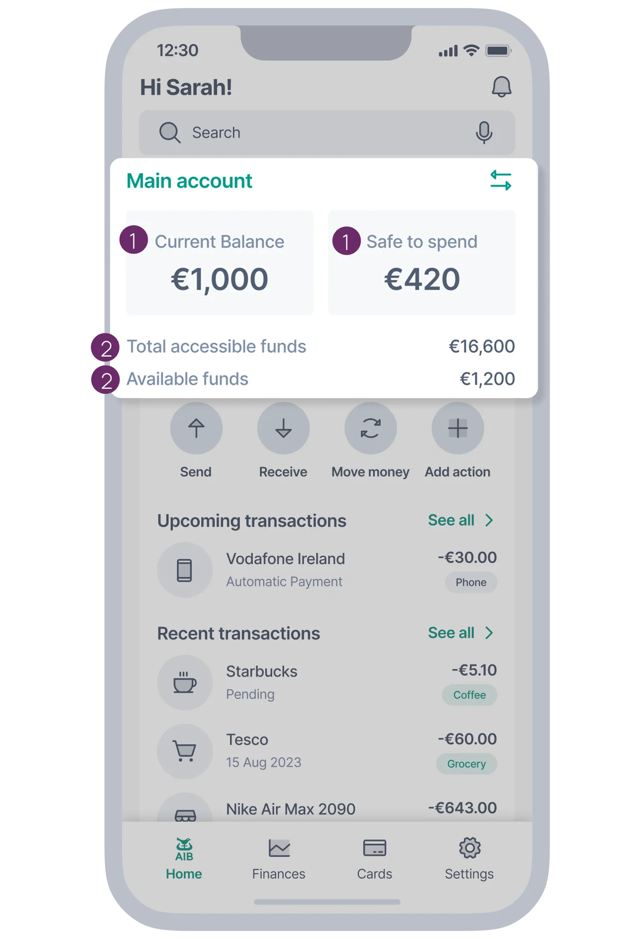
Comprehension
"What's the difference between Current Balance and Safe to Spend?"
"What's the difference between Total accessible funds and Available funds?"
"Is this information clear? Where does it confuse you?"
Value
"How do you usually budget? Would you use an app for this, and why?"
"This spending analysis feature - do you find it useful or not?"
"Are you familiar with the concept of Spaces? Have you used a similar feature on Revolut?"
Behaviour
"Would you use this category labelling feature to correct spending records?"
"If this automation rule were available, would you set it up? Why?"
"Between Rainy Day and Revolut's Pockets, which would you prefer?"
Best viewed in Figma on smaller screens
Open prototype in Figma →In testing with 52 users, over 90% expressed willingness to use Savings Spaces and Spending Insights features. 60%+ said they would reduce or replace their use of Revolut and other digital-first banking apps if AIB delivered Spending Insights. However, three issues recurred throughout testing and need to be prioritised in the next phase: unclear information hierarchy, terminology comprehension barriers, and insufficient feature discoverability.
Based on validation findings, I refined three areas: information hierarchy, spending insights, and savings automation. During the Hi-Fi phase, I applied the new component system and handed off Scenario 1 as the experience baseline for implementation.
Validation found users prioritise total balance first, with terminology confusion as the most frequent feedback. Accordingly, the information hierarchy was rebuilt - account structure consolidated into Accounts, with Safe to Spend and Available funds demoted to secondary information.
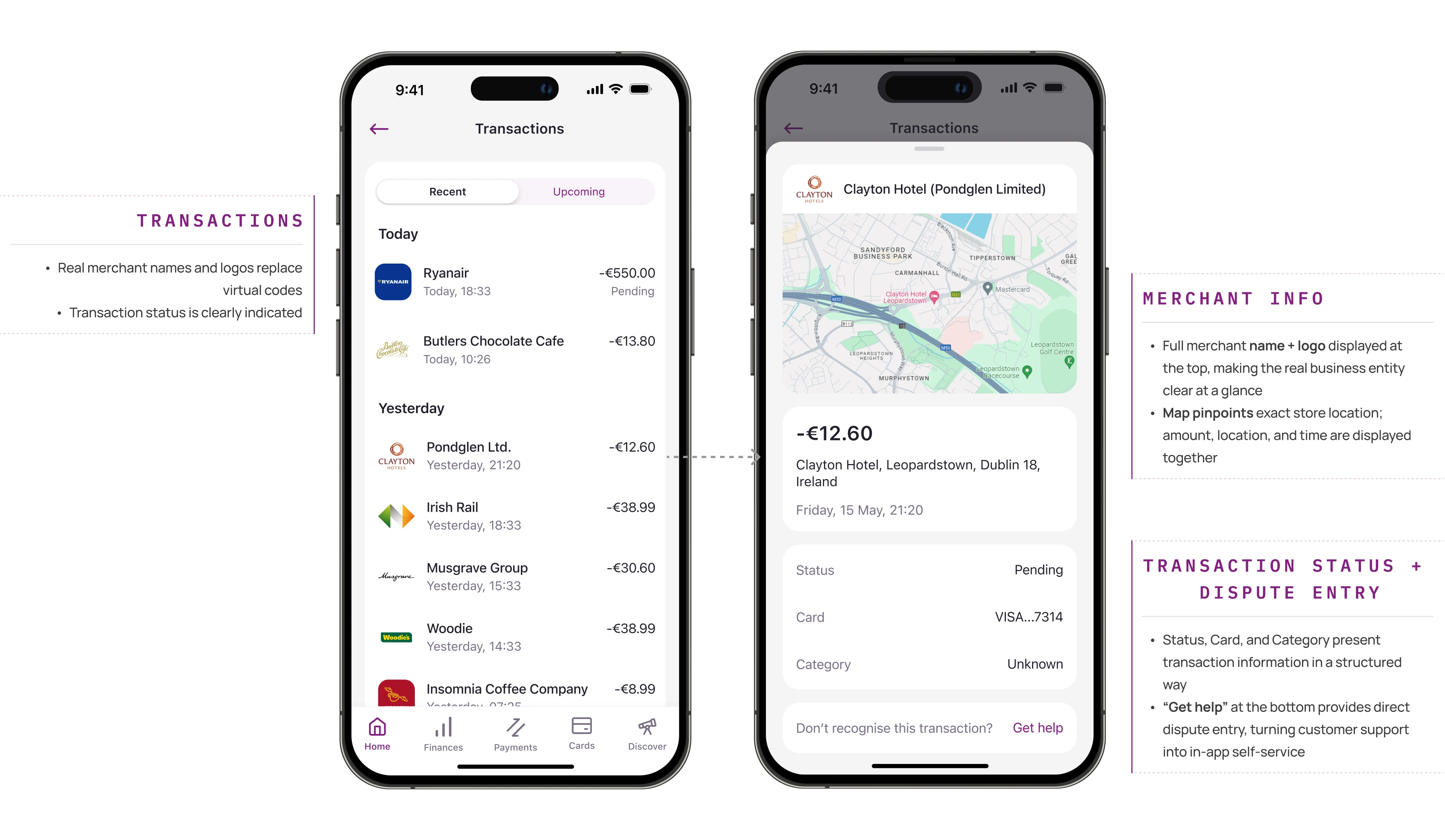
Users expressed during validation that they "really liked seeing detailed information including a map in the transaction details". Accordingly, both the transaction list and detail view were comprehensively upgraded - replacing encrypted codes with real merchant information and geographic location to eliminate confusion about unfamiliar charges.
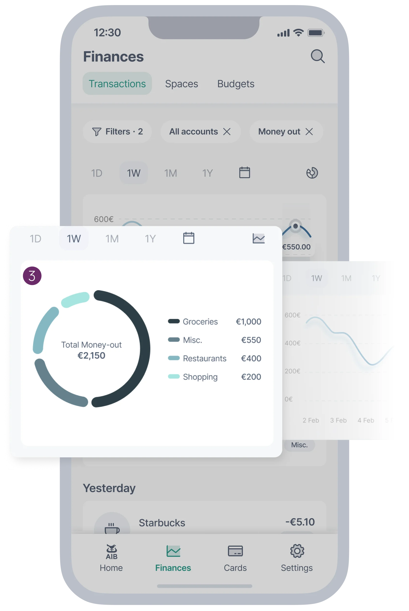
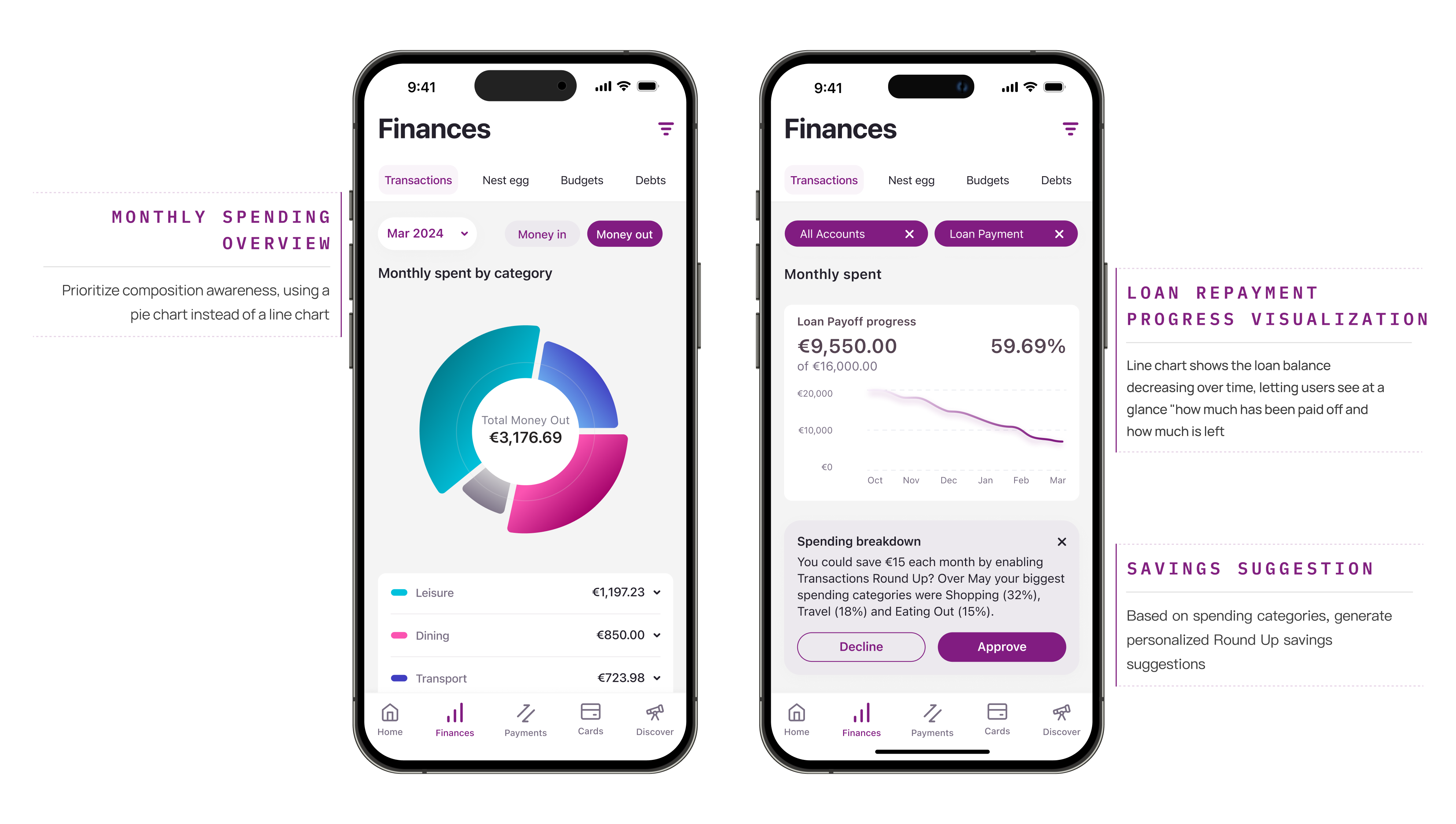
The Finances page integrates spending analysis, filtering, and proactive insights within the same flow. Users start from a monthly overview, drill down precisely to specific categories or cards via Filter, and the system simultaneously pushes personalised Spending Breakdown recommendations alongside the analysis results.
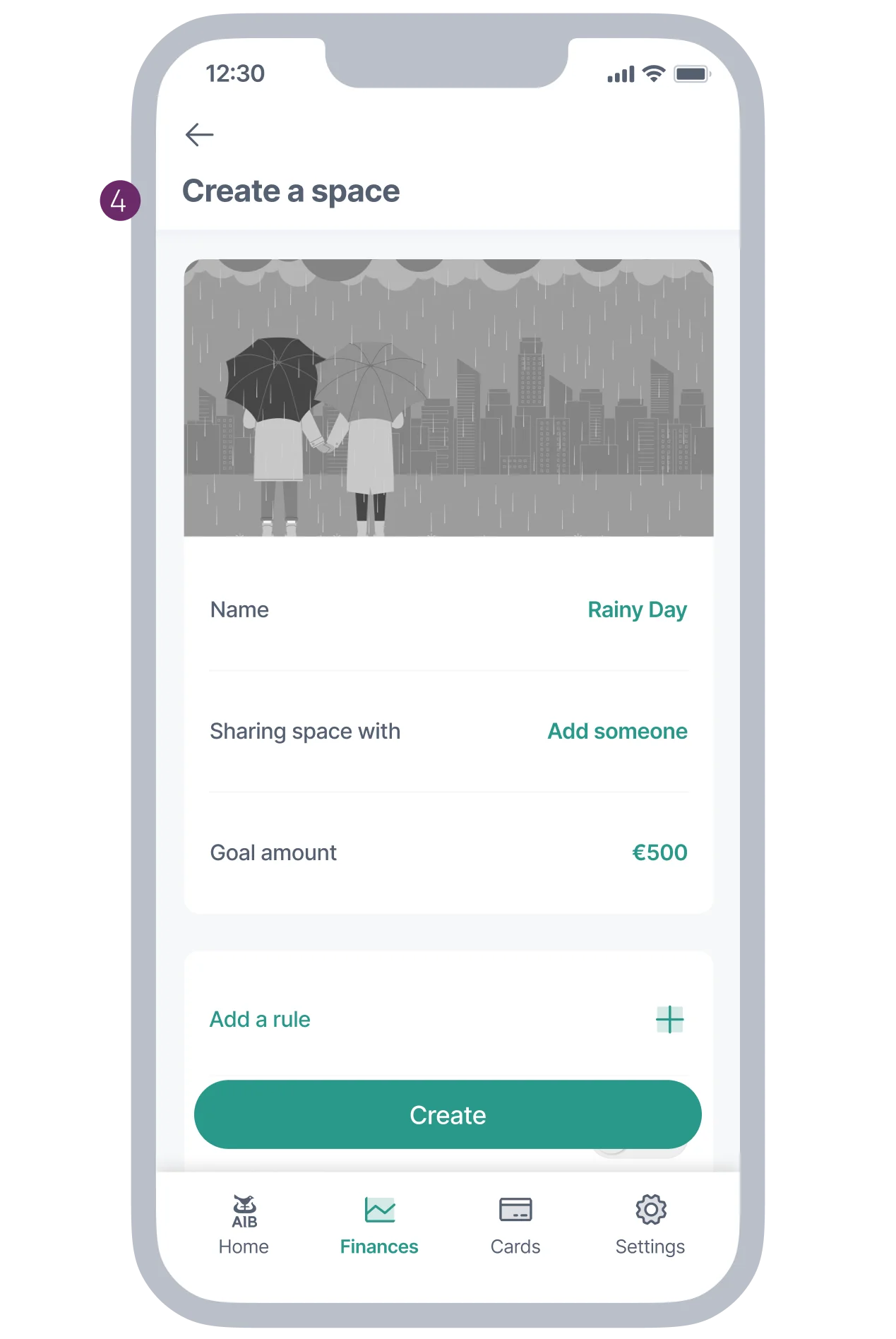
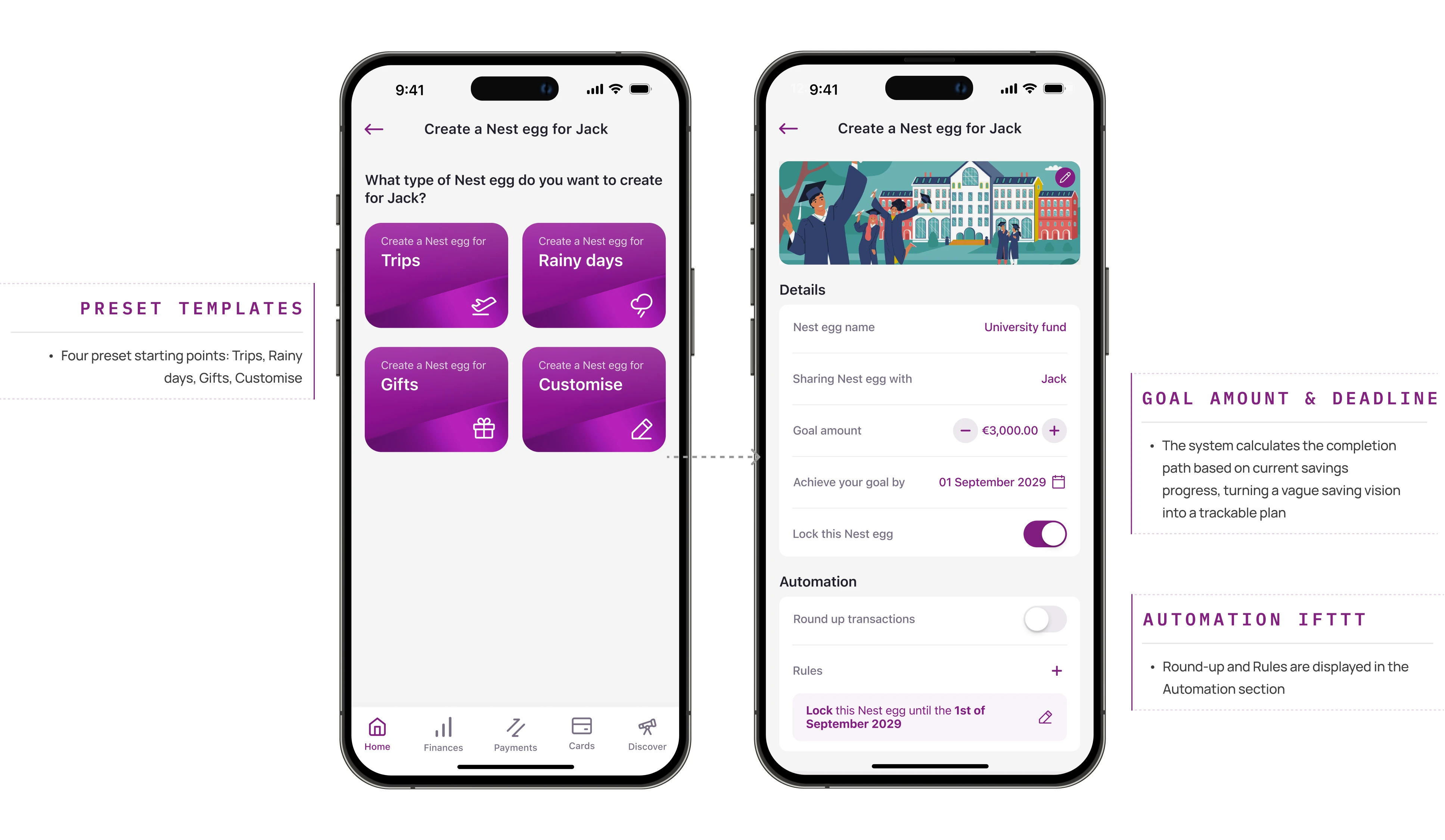
"Spaces" was renamed to Nest Egg to better capture the emotional meaning of savings. The creation flow defaults to preset templates, lowering the barrier for older users. Meanwhile, a "custom rules" entry point is retained to meet younger users' need for personalised control.
After completing the Hi-Fi iteration for Scenario 1, due to Irish banking regulatory restrictions on third-party vendor participation scope, I was unable to continue into the subsequent development phase. My work focused on the MVE phase, establishing the experience direction and design foundation for Mobile 4.0. Subsequently, Value Stream designers advanced implementation based on my experience solutions, the Design System team synced new components to the global component library, and the Implementation Squad began development by User Story. The spending category structure and savings components I designed in Scenario 1 will continue to be developed further. Mobile 4.0 is expected to launch in the second half of 2026.
Have a nice project?
Hi, my name is . You can answer me on this email . I am looking for help with a .
Scan on another device